The Flutter DropDownButton widget is one of the most useful widgets when building apps with Flutter. It gives you the ability to choose from multiple options available inside a button. This option is very useful when creating apps that require users to choose an option from multiple options. An example would be to choose the gender, which most of the apps require. You can customize the dropdown button in Flutter using DropDownButtonFormField and its multiple properties. These features make it easier to build a clean and custom dropdown Flutter interface.
In this blog, we will be discussing everything about customizing the DropDownButtonFormField Flutter example.
Using the DropDownButton widget, we can change the border radius, color, width, and much more. But for that, we will need to create separate containers as well. So, we use DropDownButtonFormField instead, which already has the ‘decoration’ property and supports easier customization of the Flutter DropDownButton style.
Let’s see how to add a dropdown button in Flutter.
How to Add a DropDownButton in Flutter Using DropDownButtonFormField?
To add a dropdown button in a Flutter app, we can use a DropDown widget. But this won’t allow us to customize the DropDown button and we will need to create a container to do that. So, we use the DropDownButtonFormField class in Flutter. It wraps the DropDownButton widget in a FormField and requires the item’s property to be defined in its constructor to perform several customizations. We will be doing that afterward.
Let us first get to know how to add a DropDownButton in Flutter using DropDownButtonFormField. The dropdownbuttonformfield in Flutter gives more control over styling and integration with forms.
Here is the code to add a DropDownButton.
Code Example
String? dropdownValue;
DropdownButtonFormField<String>(
  hint: const Text('Select your favourite fruit'),
  value: dropdownValue,
  onChanged: (String? newValue) {
    setState(() {
      dropdownValue = newValue!;
    });
  },
  items: <String>['Apple', 'Mango', 'Banana', 'Peach']
      .map<DropdownMenuItem<String>>((String value) {
    return DropdownMenuItem<String>(
      value: value,
      child: Text(value),
    );
  }).toList(),
)
Result:
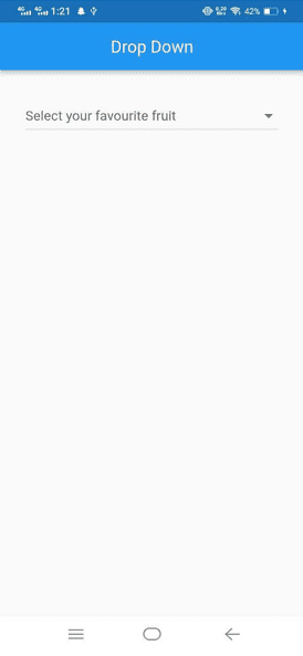
You have seen how we added a dropdown button using DropDownButtonFormField. We will be doing different customizations to the dropdown button with code examples and the results. So you can have a clear picture of how to make changes to the dropdownbuttonformfield in Flutter.
Ready? Let’s customize.
How do you add border-radius OR a rounded border to a DropdownButton in Flutter?
To add a border to the DropDownButtonFormField Flutter example, we use the decoration property, which is already present in DropDownButtonFormField.
See here:
decoration: const InputDecoration(
  border: OutlineInputBorder(),
),
It is helpful when you want to change the Flutter dropdownbutton border and style.
Now, let’s see how you can change the Flutter DropDownButtonFormField radius to make a rounded border.
decoration: InputDecoration(
  border: OutlineInputBorder(
    borderRadius: BorderRadius.circular(40),
  ),
),
Result
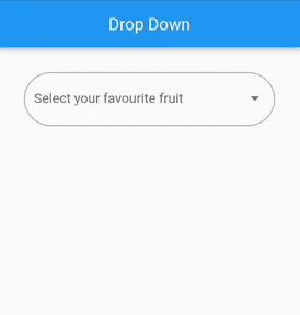
Related post: How to implement a dropdown list in Flutter?
Change the Border Color of the Dropdown Button
If you want to assign a specific color OR change the width of the dropdown button, here is how you do it.
decoration: InputDecoration(
  enabledBorder: OutlineInputBorder(
    borderRadius: BorderRadius.circular(40),
    borderSide: const BorderSide(color: Colors.black,width: 2),
  ), focusedBorder: OutlineInputBorder(
    borderRadius: BorderRadius.circular(40),
    borderSide: const BorderSide(color: Colors.red,width: 3),
  ),
),
Result

The approach allows complete control over the DropdownButton border in Flutter. It helps you match the component seamlessly with your app’s design system.
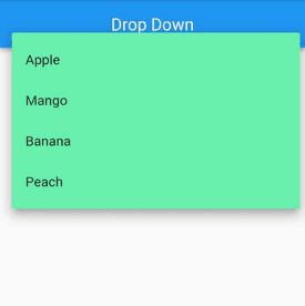
To change the color of the dropdown list, use the following command.
dropdownColor: Colors.greenAccent,It will look something like this.
Change Dropdown Button Background Color
If you want to change the Flutter dropdownbutton background color, use the fillColor property for that.
Here is how you do it:
fillColor: Colors.yellow,
filled: true,
The feature is particularly useful when you’re working on Flutter DropdownButton style personalization.
Change the Dropdown Button Arrow Size and Color
Now, if you want to change the dropdown button size, icon, or color, use the icon class for that. Here is the sample code for that.
icon: const Icon(Icons.keyboard_arrow_down_rounded),
iconSize: 40,
iconDisabledColor: Colors.blue,
iconEnabledColor: Colors.pink,

If you want to remove the border of the custom dropdown Flutter, use the decoration class and declare the border as InputBorder.none.
See here:
decoration: const InputDecoration(border: InputBorder.none),

The Final Form
As you have seen a lot of customizations that we did with the dropdown button. Let us see the final form of dropdown button having different customizations in the code.
The Final Code
DropdownButtonFormField<String>(
  icon: const Icon(Icons.keyboard_arrow_down_rounded),
  iconSize: 40,
  iconDisabledColor: Colors.blue,
  iconEnabledColor: Colors.pink,
  decoration: InputDecoration(
    fillColor: Colors.yellow,
    filled: true,
    enabledBorder: OutlineInputBorder(
      borderRadius: BorderRadius.circular(40),
      borderSide: const BorderSide(
        color: Colors.black,
        width: 2,
      ),
    ),
    focusedBorder: OutlineInputBorder(
      borderRadius: BorderRadius.circular(40),
      borderSide: const BorderSide(
        color: Colors.red,
        width: 3,
      ),
    ),
  ),
  hint: const Text('Select your favourite fruit'),
  dropdownColor: Colors.greenAccent,
  value: dropdownValue,
  onChanged: (String? newValue) {
    setState(() {
      dropdownValue = newValue!;
    });
  },
  items: <String>['Apple', 'Mango', 'Banana', 'Peach']
      .map<DropdownMenuItem<String>>((String value) {
    return DropdownMenuItem<String>(
      value: value,
      child: Text(
        value,
      ),
    );
  }).toList(),
),
Final Result

Conclusion
In this blog, we covered everything related to customizing a dropdown button in Flutter. We hope that you learned a lot about Flutter DropDownButtonFormField.
Whether you’re looking to control the Flutter DropdownButton border, change the icon, apply background colors, or manage border radius, the DropdownButtonFormField offers plenty of flexibility. It simplifies the customization process, making it easier to tailor the widget to your design needs.
If you want to build your own custom dropdown Flutter interface with enhanced style, border control, and background tweaks, DropDownButtonFormField is your go-to.
Flutter comes with a lot of widgets that collectively make it a perfect framework for developers to build an interactive app. Several takeaways contribute to developing a successful end product. This includes product ideation, designing, wireframing, development, marketing, and whatnot. So, we need to consider all of them to build a product that excels in the online marketplace at its best.
Finally, it’s a wrap to the quick guide on how to add and customize the dropdown button in Flutter using DropDownButtonFormField. We have provided the source code for each of the customizations we did. Use them to practice, practice, and practice. If you come across any hurdles, feel free to reach out to us. Our Flutter app development company has cooperative and dedicated Flutter developers who are always there to help Flutter aspirants.


