You might have seen little icon buttons in apps that we select and unselect by tapping them. A common example would be those interests (sports, games, education) that some social media apps like Twitter and Pinterest ask you to select when you create an account. The Flutter Choice Chip widget helps build beautiful and responsive user interfaces. The ChoiceChip is a material design widget representing a set of options a user can choose from.
In this article, we will explore the ChoiceChip widget in detail and learn how to use it in Flutter. We will cover the basics of ChoiceChip, how to customize it, and how to use it in a group.
Overall, this will be a complete guide to the ChoiceChip widget in Flutter, making it easier for developers to build beautiful and interactive user interfaces.
Getting Started With Flutter Choice Chip Widget
The Flutter Choice Chip widget is a powerful tool for creating user interfaces that allow users to select from a set of options. It is a helpful widget that makes the selections easy and enhances the user experience.
To start using the ChoiceChip widget, we must first enable Material3 from the themeData.
Here is how you do it:
return MaterialApp(
 title: 'Choice Chip in Flutter',
 theme: ThemeData(useMaterial3: true),
 home: const HomePage(),
);
Now, you need to store the chip’s status, whether selected or unselected. For that, we use a variable and set the value of isChipSelected to true or false.
var _isChipSelected = true;
The value of this variable can either be true or false. The variable will function according to the value of isChipSelected the property. If its value is true, the chip will be selected; if its value is false, it is unselected.
Creating a ChoiceChip
To create a ChoiceChip, you need to use the ChoiceChip constructor. The constructor requires a label parameter that specifies the text to display on the ChoiceChip. Here’s an example of how to create a simple ChoiceChip:
ChoiceChip(
  label: const Text('Choice Chip'),
  selected: _isChipSelected,
  onSelected: (_) {
    _isChipSelected = _;
    setState(() {});
  },
),
Flutter Choice Chip Example
Here is the choice chip example for the code provided above. You can see the default choice chip has been added to the app. You can also see the chip gets selected when we tap it.
Output


Multiple Choice Chip Flutter
In some cases, we need to add multiple chips for users to choose from. Take an MCQ as an example. Let’s use the ChoiceChip widget to accept multiple choices in Flutter. 😉
Here, we will be answering a question having multiple choices to choose from. Let’s see how to deal with multiple-choice chip Flutter.
import 'package:flutter/material.dart';
class HomePage extends StatefulWidget {
 const HomePage({Key? key}) : super(key: key);
 @override
 State<HomePage> createState() => _HomePageState();
}
class _HomePageState extends State<HomePage> {
 final _availableChoices = [
   'Andrew Tate',
   'Micheal Scofield',
   'John Snow',
   'Me',
 ];
 String? _selected;
Firstly, we stored the options of the question using ‘_availableChoices.’ After that, we must store the selected answer using a string as String _selected.
You might be wondering where the question is. 😛 So, we use a const variable and a text widget inside it to display the question we want. Like this:
const Text('Who is the top G?'),
// Rendering the answers
Here comes the actual step where we need to render the answer. For that, we create a new variable and save its value by calling the value from the answer list as:
final choice = _availableChoices[i];
To make sure that the answer stored at selected is equal to the choice, assign ‘choice’ to the selected property as _selected == choice,.
Results
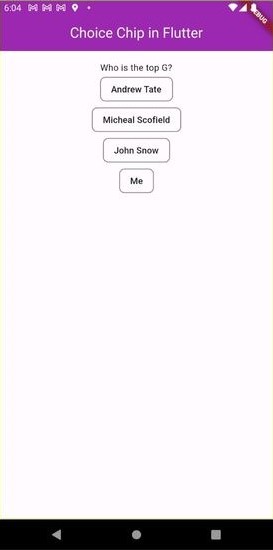

We use the if else statement to manage the single chip selection. If you tap a choice chip that is already selected, the selected value will become null and you’ll have no option as selected.
Similarly, if no option is selected, the else statement will store the value of the selected chip you tap on. Here is what the code looks like:
label: Text(choice),
selected: _selected == choice,
onSelected: (_) {
   if (_selected == choice) {
     _selected = null;
  } else {
    _selected = choice;
}
Next, we need to create children according to the number of answers in the list. We use ‘itemCount’ property to declare the number of children as:
itemCount: _availableChoices.length,
Single Select Choice Chip Flutter
In Flutter, sometimes, we might need to select a single option from a set of options. The Single Select Choice Chip provides a simple and intuitive user interface for selecting one value among many. Let us learn how to create a single select flutter choice chip with an example code.
Now, we can create a Single Select Choice Chip widget by using the following code:
int _selectedIndex = 0;
List<String> _options = ['Option 1', 'Option 2', 'Option 3'];
Widget build(BuildContext context) {
  return Wrap(
    children: List<Widget>.generate(
      _options.length,
      (int index) {
        return ChoiceChip(
          label: Text(_options[index]),
          selected: _selectedIndex == index,
          onSelected: (bool selected) {
            setState(() {
              _selectedIndex = selected ? index : null;
            });
          },
        );
      },
    ).toList(),
  );
}
In this example, we have created a list of options and an integer variable _selectedIndex to keep track of the selected option. We have used the List.generate method to generate a list of ChoiceChip widgets for each option in the _options list. Furthermore, we have set the selected property of the ChoiceChip to true for the selected option and false for the rest.
We have also added an onSelected callback function to handle user interactions with the ChoiceChip. The onSelected function updates the value of _selectedIndex with the index of the selected option and triggers a rebuild of the widget to update the UI.
Moreover, we can customize the ChoiceChip widget’s appearance by using properties such as labelStyle, backgroundColor, selectedColor, etc.
Customizing Flutter ChoiceChip
The ChoiceChip widget in Flutter provides several properties that you can use to customize its appearance. Customization helps improve the UI of your app tailored to the end-users’ needs. This section explores some of the most commonly used properties for customizing the ChoiceChip widget.
Changing the Text Style
To change the text style of the ChoiceChip label, you can use the label style property. This property takes a TextStyle object, which allows you to customize the text’s font, size, color, and other aspects. Here’s an example of how to change the text style of a ChoiceChip:
ChoiceChip(
 label: Text('Choice Chip'),
labelStyle: TextStyle(
color: Colors.white,
fontSize: 16.0,
fontWeight: FontWeight.bold,
 ),
)
Changing the Background Color
To change the background color of the ChoiceChip, you can use the backgroundColor property. This property takes a Color object and sets the background color of the ChoiceChip. Here’s an example of how to change the background color of a ChoiceChip:
backgroundColor: Colors.orangeAccent,
Flutter Choice Chip Selected Text Color
You can use the property to change the selected text color of a Choice Chip widget in Flutter. This property takes an TextStyle object, which you can use to customize the selected chip’s text color, font size, font weight, and other text-related properties.
Here’s an example code snippet that demonstrates how to change the selected text color of a Choice Chip:
ChoiceChip(
  label: Text('Option 1'),
  selected: true,
  selectedTextStyle: TextStyle(
    color: Colors.white, // set the selected text color here
    fontWeight: FontWeight.bold,
  ),
  onSelected: (isSelected) {},
)
In this example, we set the selectedTextStyle property to a TextStyle Object with a white text color and a bold font weight. This will change the text color of the selected Choice Chip to white when the user selects it.
Changing the Selected Color
Using the selectedColor property, you can also change the color of the selected ChoiceChip. This property takes a Color object and sets the ChoiceChip’s color when selected. Here’s an example of how to change the selected color of a ChoiceChip:
selected: true,
selectedColor: Colors.green,
)

Here is the final code for all the above customization options:
ChoiceChip(
  label: const Text('Choice Chip'),
  backgroundColor: Colors.orangeAccent,
  selectedColor: Colors.green,
  selected: _isChipSelected,
  onSelected: (_) {
    _isChipSelected = _;
    setState(() {});
  },
),
Adding Icons to the ChoiceChip
You can add an icon to the ChoiceChip by using the avatar property. This property takes a Widget object, an icon or any other widget. Here’s an example of how to add an icon to a ChoiceChip:
ChoiceChip(
 avatar: Icon(Icons.check),
 label: Text('Choice Chip'),
)
By following the steps and examples outlined in this article, developers can easily implement the ChoiceChip widget in their Flutter projects and provide an intuitive and efficient user selection tool. The ChoiceChip widget is a powerful addition to any Flutter developer’s toolkit. Its versatility and ease of use can help create an excellent user experience in a wide variety of applications.
Conclusion
That was it for the brief go-through of the ChoiceChip widget in Flutter. We hope that you will this article helpful. ChoiceChip widget in Flutter is a versatile and customizable tool for creating user interfaces with interactive selections. It allows users to select one option from a set of options, making it suitable for various scenarios such as filtering, sorting, and selecting options.
In this article, we have covered the basics of using the ChoiceChip widget in Flutter, including creating a simple widget, customizing its appearance, and grouping multiple chips together.
If you have an app idea and want to hire a Flutter app developer to turn it into reality, you can count on us. We have a team of highly skilled developers to turn any complex business idea into a real-world application. Feel free to contact us and book a free consultation call today.
Cheers!


