When you use the same app on different devices, the content may stretch or appear inappropriately. This disturbs the app’s UI and ultimately hurts the user experience as well. There could be a way where you could adjust font size based on screen size. That’s what you’re going to learn in this blog.
There are different ways in which you can auto-adjust the font size according to the screen size. One way is to go with the BuildContext class and another way is to use LayoutBuilder class.
Overview
Using BuildContext doesn’t give you much flexibility to resize your text. It traces each widget in a tree and locates them and their position inside that widget tree. Which limits the developer to specify the position and attributes of a widget.
Whereas, Layout Builder builds a widget tree that depends on the size of the parent widget. The LayoutBuidler is the most common method used to adjust Flutter font size.
Moreover, if you don’t define a parent widget using the LayoutBuilder method then Flutter will consider the device itself as a parent widget.
If we set the device’s screen size as a parent widget, the LayoutBuilder automatically adjusts the google font flutter size according to the screen size and the UI seems to be perfect on any screen that you open the app on. We just need to define a particular screen size and assign a font size to it. This way, the font size gets adjusted according to the screen size.
Dynamically Resize Text Based on Screen Size (Mobile, iPad/Tablet, Web or Desktop)
Mostly, the ideal screen size for mobile apps is less than or equal to 480 pixels in width. And that of iPad/tablet ranges from 481 to 960 pixels. Similarly, the web or desktop platforms have screen sizes of more than 960 pixels in width.
So we assign a particular font size to each of the screen sizes. As a result, the text fits perfectly on the screen size of the app opened on any device.
Here is the code.
LayoutBuilder(
  builder: (_, c) {
    final width = c.maxWidth;
    var fontSize = 16.0;
    if (width <= 480) {
      fontSize = 16.0;
    } else if (width > 480 && width <= 960) {
      fontSize = 22.0;
    } else {
      fontSize = 28.0;
    }
    return Center(
      child: Column(
        mainAxisAlignment: MainAxisAlignment.center,
        crossAxisAlignment: CrossAxisAlignment.center,
        children: [
          Text(
            'This is a responsive text... as you can see it's size is '
            'adjusting on different devices',
            textAlign: TextAlign.center,
            style: TextStyle(fontSize: fontSize),
          ),
          Text(
            'This is a responsive text... as you can see it's size is '
            'adjusting on different devices',
            textAlign: TextAlign.center,
            style: TextStyle(fontSize: fontSize),
          ),
          Text(
            'This is a responsive text... as you can see it's size is '
            'adjusting on different devices',
            textAlign: TextAlign.center,
            style: TextStyle(fontSize: fontSize),
          ),
          Text(
            'This is a responsive text... as you can see it's size is '
            'adjusting on different devices',
            textAlign: TextAlign.center,
            style: TextStyle(fontSize: fontSize),
          ),
        ],
      ),
    );
  },
),
As you can see, in the start, we have used the container final width = c.maxWidth; to specify the maximum width of any screen. Moreover, we limited the width to a particular extent just to categorize it for different types of devices. Following that, we have assigned the font sizes to each width range. This will display the font size accordingly.
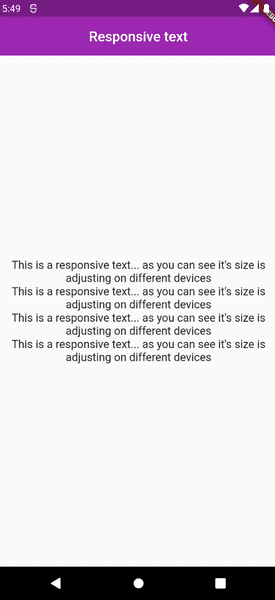
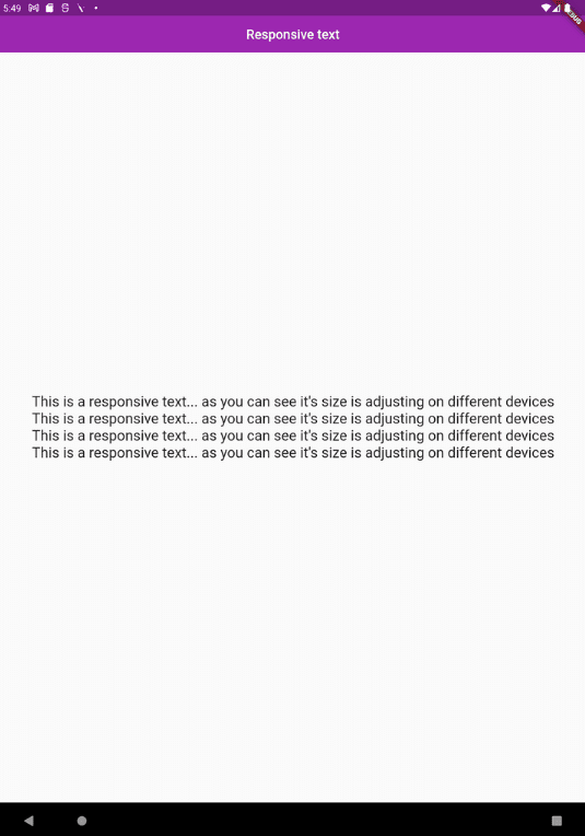
You can see the results for mobile, iPad/tablet, and web/desktop.
Mobile:
iPad/Tablet:
Web/Desktop:

Wrap Up
Finally, it’s a wrap to the guide on how to automatically change the font size based on screen size. We hope that you have learned how to cope with different screens messing up the font size.
We have provided you with the source code also. Use it to practice building scalable apps. Moreover, if you have any queries or suggestions related to Flutter app development or want to hire Flutter developers, feel free to reach out to us with your concerns. FlutterDesk, being a top-rated Flutter app development company is always open to help.