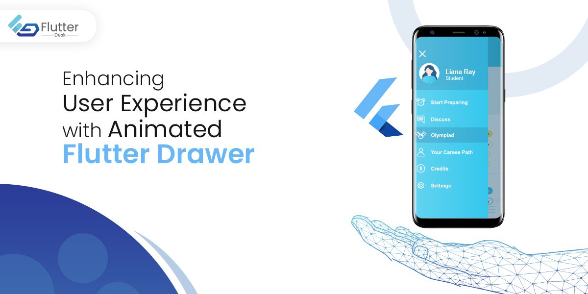
Developers are using a wide range of modern animations in their mobile applications to improve not only the UI but also the user experience. Having motion and feedback animations can ultimately result in better interactivity. You can use an animated Flutter drawer to improve the navigation from one page to another in an aesthetically pleasing manner.
By clicking the hamburger menu in the app bar or by swiping, the navigation drawer will open. Further, the Material Panel in the Flutter framework allows Flutter developers to add customizable motion effects that will show navigation links in an app.
This article will help you build an amazing flutter project that you can add to your resume.
What is the Drawer Widget in Flutter?
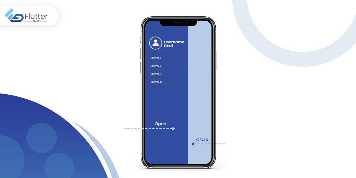
With the help of the Drawer widget, users can access different pages and functions within a mobile app. The navigation drawer is usually opened by clicking the three horizontal lines or hamburger menu at the top of the scaffold, which provides horizontal movement. A typical opening is from the left side of the screen, but it can be changed to the right.
To use the drawer widget, you need to import this package: “package: flutter/material.dart.” It has a “scaffold.drawer” property that comes with a scrollable ListView form. Three components make up the navigation Drawer: the header, the body, and the footer.
As established before, the navigator lists the Drawer’s child items that, upon clicking, will take to different routes within the app.
By default, when the navigation drawer opens, it takes up more than 50% of the screen. You can change the navigation drawer width to occupy a predefined space.
Properties of Flutter Drawer
Given below are some of the properties of the Drawer that determine its functionality:
- Child: It is the widget/item within the Drawer
- hashCode: It represents the hash code for this widget
- Key: Specify how widgets are replaced in the tree.
- runtimeType: determines the runtime type of the drawer object
- Elevation: The placement of the Drawer for the scaffold in the Z-coordinate
- semanticLabel: It defines the screen transitions
Function
The function of the Flutter Drawer is
- build(BuildContext context): It simply presents the location of the Drawer widget in Flutter’s Widget Tree.
Flutter Drawer Types
The Flutter app drawer is mainly classified into three categories, which are as follows:
- Standard Navigation Drawer
- Modal Navigation Drawer
- Bottom Navigation Drawer
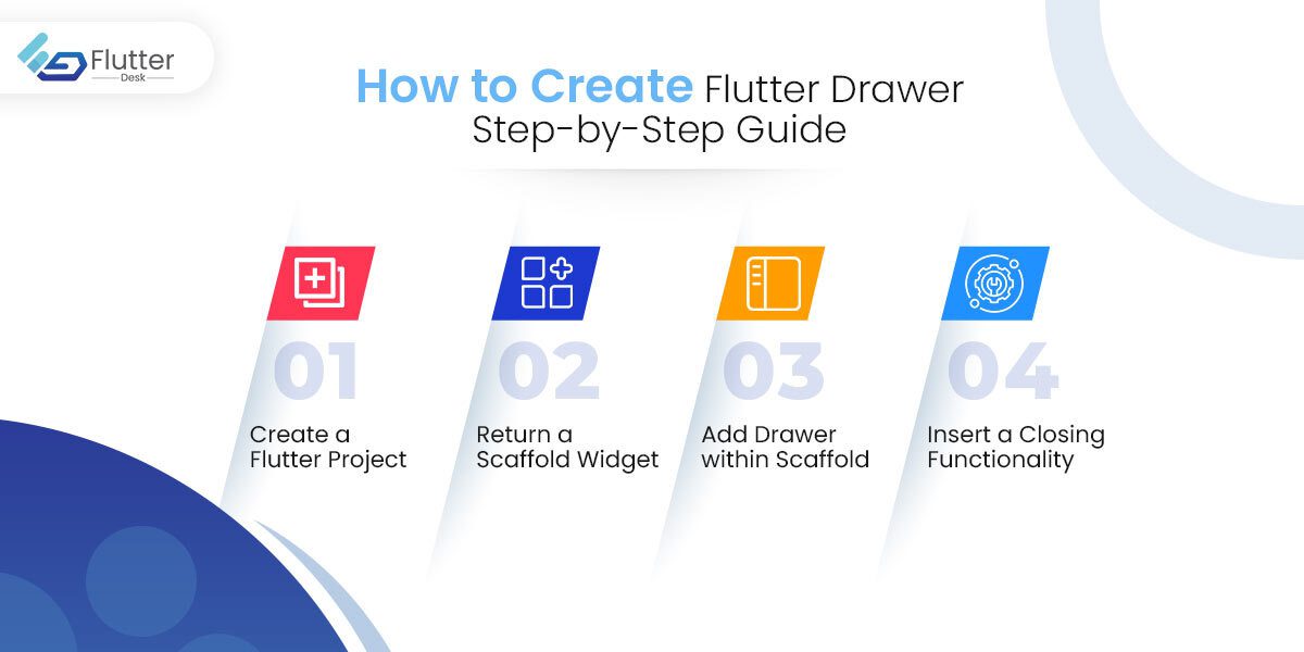
How to Create a Navigation Flutter Drawer: Step-by-Step Guide
Drawers present an opportunity to navigate different destinations instantly. This feature is especially helpful for complex apps with many screens, making it easier for the users to switch screens. Moreover, the implementation of the Drawers widget is simple and easy.
Here is how you can use the Flutter Drawers for your app:
Create a Flutter Project
You can create your project by opening the terminal and navigating to the desired location. The project will be created with the “flutter create project_name” command.
"flutter create file_name"Related Post – Inkwell Flutter
Return a Scaffold Widget
Within the MyApp Class of your stateful/stateless widget returns the Scaffold widget. It is essential for providing your Flutter app’s basic visual layout structure.
Scaffold(
drawer:
);
Related Post – Flutter Card Widget
Add Drawer within Scaffold
In this step, the Drawer is assigned ListView as its child. Additionally, it is possible to add a container and then add ListView as its child. All the items you wish to be in the navigation menu will be displayed here.
Further, you need to include the DrawerHeader to create a material design header. Within the DrawerHeader, insert the Text widget to add the text.
For each page add the ListTitle widget with an icon and title.
drawer: Drawer(
//...
),);
Insert a Closing Functionality
Finally, the closing functionality on the Drawer is implemented by the Navigator. You can also do it by changing Navigator State.
Navigator.of(context).pop();
To open the Drawer from the different button, you can add this function:
_scaffoldKey.currentState.openDrawer().
Implementation
import 'package:flutter/material.dart';
void main() => runApp(const MyApp());
class MyApp extends StatelessWidget {
  const MyApp({super.key});
  static const appTitle = 'Drawer Demo';
  @override
  Widget build(BuildContext context) {
    return const MaterialApp(
      title: appTitle,
      home: MyHomePage(title: appTitle),
    );
  }
}
class MyHomePage extends StatelessWidget {
  const MyHomePage({super.key, required this.title});
  final String title;
  @override
  Widget build(BuildContext context) {
    return Scaffold(
      appBar: AppBar(title: Text(title)),
      body: const Center(
        child: Text('My Page!'),
      ),
      drawer: Drawer(
        // Add a ListView to the drawer. This ensures the user can scroll
        // through the options in the drawer if there isn't enough vertical
        // space to fit everything.
        child: ListView(
          // Important: Remove any padding from the ListView.
          padding: EdgeInsets.zero,
          children: [
            const DrawerHeader(
              decoration: BoxDecoration(
                color: Colors.blue,
              ),
              child: Text('Drawer Header'),
            ),
            ListTile(
              title: const Text('Item 1'),
              onTap: () {
                // Update the state of the app
                // ...
                // Then close the drawer
                Navigator.pop(context);
              },
            ),
            ListTile(
              title: const Text('Item 2'),
              onTap: () {
                // Update the state of the app
                // ...
                // Then close the drawer
                Navigator.pop(context);
              },
            ),
          ],
        ),
      ),
    );
  }
}
Source: https://docs.flutter.dev/cookbook/design/drawer
How to Add Details in Navigation Drawer Header and AboutListTile
Most often, the navigation drawer displays user information inside the drawer header. The easy fix for this is to use a UserAccounts DrawerHeader. This widget displays information related to the user, like profile picture, username, and email. In addition, you can direct people to a specific user detail page when they tap on the user information.
Here is how you can display user details in the navigation Flutter drawer:
- Add the UserAccountsDrawerHeader instead of DrawerHeader.
- Set the username by adding the accountName parameter.
- Add the accountEmail parameter to set the user email.
- With the currentAccountPicture parameter, add the user’s profile picture.
In the navigation drawer, you can show additional information about the app, like its version, official website, and more, in a widget called AboutListTile.
To display the widget, follow these steps:
- Add AboutListTile inside the ListView at the very end under the ListTile pages.
- Add icon and child parameters within the AboutListTile widget.
- Inside the child, add the text widget.
- Also, add the applicationVersion parameter that includes the current version of the app.
Animated Flutter Drawer
The animated Flutter drawer provides an amazing user experience. Here in this example published on pub.dev, you will be able to create an animated drawer widget in Flutter that has the following features:
- You can set the animation speed, X and Y coordinates, and angle of rotation.
- Use the icon to open and close the Drawer.
- You can also add gradient colors.
- Highly customizable widgets.
- Have a shadow widget to enhance the aesthetics.
Related Post – Flutter Gridview
Parameters for Animated Drawer
Below are some of the parameters for the animated Flutter drawer
| Parameter Name | Description | Data type |
| homePageContent | Present data on Home Page | widget |
| menuPageContent | Show items on the Menu Page after the opening of the Drawer | widget |
| shadowColor | It is behind the HomePage and is animated with it. | color |
| backgroundGradient | It shows the background colors of the Drawer | gradient |
| openIcon | The icon that opens the Drawer | widget |
| closeIcon | An icon is displayed for closing the Drawer | widget |
| homePageYValue | Home Page Widget’s Y-Coordinate Value to be translated in animation. | double |
| homePageXValue | In animation, this value will represent the X-Coordinate Value for the Home Page Widget. | double |
Usage
AnimatedDrawer(
      homePageXValue: 150,
      homePageYValue: 80,
      homePageAngle: -0.2,
      homePageSpeed: 250,
      shadowXValue: 122,
      shadowYValue: 110,
      shadowAngle: -0.275,
      shadowSpeed: 550,
      openIcon: Icon(Icons.menu_open, color: Color(0xFF1f186f)),
      closeIcon: Icon(Icons.arrow_back_ios, color: Color(0xFF1f186f)),
      shadowColor: Color(0xFF4c41a3),
      backgroundGradient: LinearGradient(
        colors: [Color(0xFF4c41a3), Color(0xFF1f186f)],
      ),
      menuPageContent: Padding(
        padding: const EdgeInsets.only(top: 100.0, left: 15),
        child: Container(
          child: Column(
            crossAxisAlignment: CrossAxisAlignment.start,
            children: [
              FlutterLogo(
                size: MediaQuery.of(context).size.width / 4,
              ),
              Row(
                children: [
                  Text(
                    "FLUTTER",
                    style: TextStyle(
                        fontSize: 17,
                        color: Colors.white,
                        fontWeight: FontWeight.bold),
                  ),
                  Text(
                    "HOLIC",
                    style: TextStyle(
                        fontSize: 17,
                        color: Colors.blue[200],
                        fontWeight: FontWeight.bold),
                  )
                ],
              ),
              Padding(
                padding: EdgeInsets.only(bottom: 40),
              ),
              Text(
                "Home Screen",
                style: TextStyle(
                  color: Colors.white,
                ),
              ),
              Padding(
                padding: EdgeInsets.only(bottom: 20),
              ),
              Text(
                "Screen 2",
                style: TextStyle(
                  color: Colors.white,
                ),
              ),
              Padding(
                padding: EdgeInsets.only(bottom: 20),
              ),
              Divider(
                color: Color(0xFF5950a0),
                thickness: 2,
              ),
              Padding(
                padding: EdgeInsets.only(bottom: 20),
              ),
              Text(
                "About",
                style: TextStyle(
                  color: Colors.white,
                ),
              ),
            ],
          ),
        ),
      ),
      homePageContent: Container(
        width: MediaQuery.of(context).size.width,
        height: MediaQuery.of(context).size.height,
        color: Colors.blue[200],
        child: Center(
          child: Image.network(
            "https://user-images.githubusercontent.com/38032118/105316779-2a480980-5be3-11eb-900e-18fcd599493d.png",
            height: MediaQuery.of(context).size.height / 2,
          ),
        ),
      ),
    );
Source: https://pub.dev/packages/animated_drawer
Conclusion
Usability is taken into consideration when developing apps. In addition to amazing features, mobile apps should also be user-friendly so that anyone can benefit from them.
Flutter has different widgets that are specifically designed for better UX. Among these, the Flutter drawer makes it easy for users to navigate between different pages. The purpose of this article was to provide comprehensive information about this widget and how to use it in future Flutter projects.
Get in touch with us if you need to hire flutter developer from a professional flutter development company.