While building apps with Flutter, several UI/UX design elements collectively make your app more interactive. As the UI of your app defines its future, you should always value making the UI of your app as engaging as you can. This will increase the user retention rate, which is one of the major steps toward your app’s success. Dart provides ready-to-use material card classes that you can use to customize the visuals of the widget. The flutter card widget is a built-in widget in Flutter that helps you create design elements and add functionality to them.
These cards make the application UI look more beautiful and easy to use. In this blog, we will get to know what card widgets in Flutter are and how these widgets work with an example.
What is Flutter Card?
The flutter card widget is an implementation of material design that includes buttons, expanding panels, animations, and much more. Material is a design system developed by Google that helps you build high-quality digital experiences for mobile, desktop, and web. The card can be a button, sheet, or box representing information related to a particular action or location.
Creating a card in flutter is not a big deal. You just need to call the card constructor and then pass a widget as a child property. This will display the card and the action inside it.
Let’s discuss the properties of the flutter card widget and explore it more clearly with the flutter card example.
Related Post – disable back button flutter
Properties of Card Widget
Whenever we construct a card class in Flutter, it has the following attributes:
borderOnForeground: This property requires a Boolean value as an input to decide whether to print the borders or not.
clipBehavior: This property helps clipping the content inside the card,
elevation: It takes the double value to decide the z-coordinate where the card should be positioned.
color: This property assigns a background color to the card.
shadowColor: It takes the color class as the object and assigns that color to the shadow. This color appears beneath the card and by default, the color is set to black.
margin: This property adds empty spaces around the card with the help of EdgeInsetsGeometry as the object.
shape: This property specifies the shape of the card. For example circular border, beveled border, or stadium border.
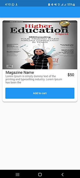
Flutter Card Example
You can customize cards in Flutter by changing their attributes. Let’s have a look at an example for a better demonstration of the card widget in flutter.
Card(
  shape: RoundedRectangleBorder(
      borderRadius: BorderRadius.circular(10)),
  elevation: 4,
  child: Column(
    children: [
      ClipRRect(
        borderRadius: const BorderRadius.only(
          topLeft: Radius.circular(10),
          topRight: Radius.circular(10),
        ),
        child: Image.asset(
          AppImages.magazinePhoto,
          height: 250,
          width: MediaQuery.of(context).size.width,
          fit: BoxFit.fill,
        ),
      ),
      ListTile(
        title: const Text(
          'Magazine Name',
          style: TextStyle(fontSize: 20),
        ),
        trailing: const Text(
          '\$50',
          style: TextStyle(fontSize: 20),
        ),
        subtitle: Text(
          lorem.substring(0, 100),
        ),
      ),
      Padding(
        padding: const EdgeInsets.all(15.0),
        child: TextButton(
          onPressed: () {},
          style: TextButton.styleFrom(
              backgroundColor: Colors.blue,
              minimumSize:
                  Size(MediaQuery.of(context).size.width, 56)),
          child: const Text(
            'Add to cart',
            style: TextStyle(color: Colors.white),
          ),
        ),
      )
    ],
  ),
),
Result
Conclusion
Finally, you must have an idea about the cards in a flutter after going through this blog. FlutterDesk continues to help and encourage Flutter aspirants to learn newer development techniques and follow the latest development trends. Lastly, feel free to leave a comment and ask away any questions your mind is ticking.