Unleashing Flutter Riverpod: State Management Mastery
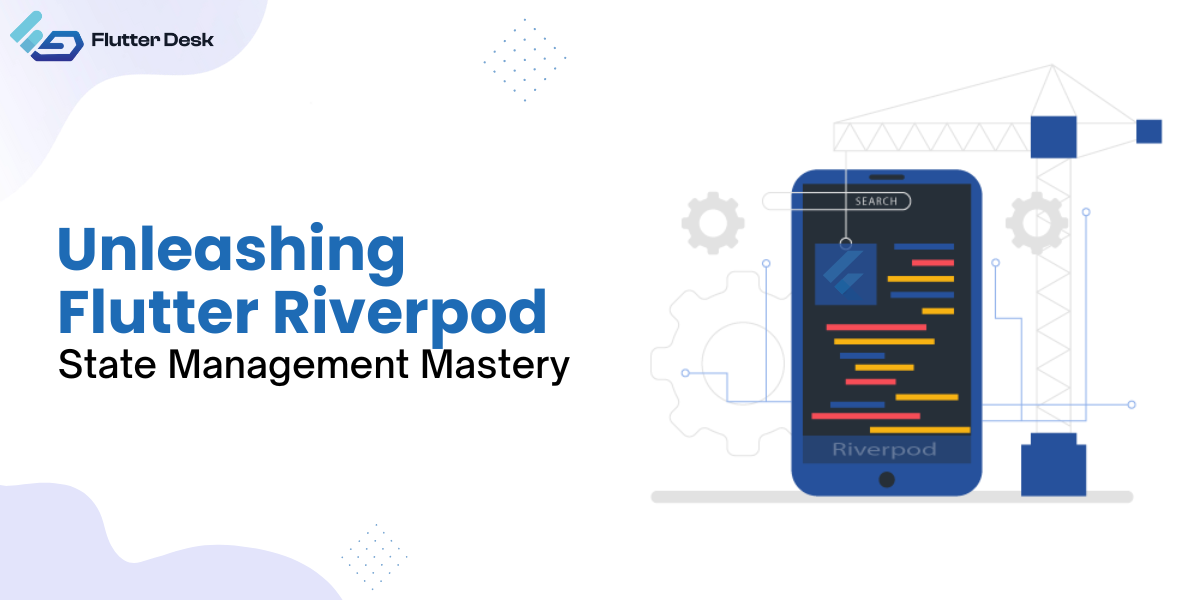
Riverpod Flutter has revolutionized how we handle state in our applications and has swept the Flutter development community. Using Flutter

Riverpod Flutter has revolutionized how we handle state in our applications and has swept the Flutter development community. Using Flutter

Have you ever used a smartphone and could swipe away or dismiss certain items on the screen? In Flutter, a
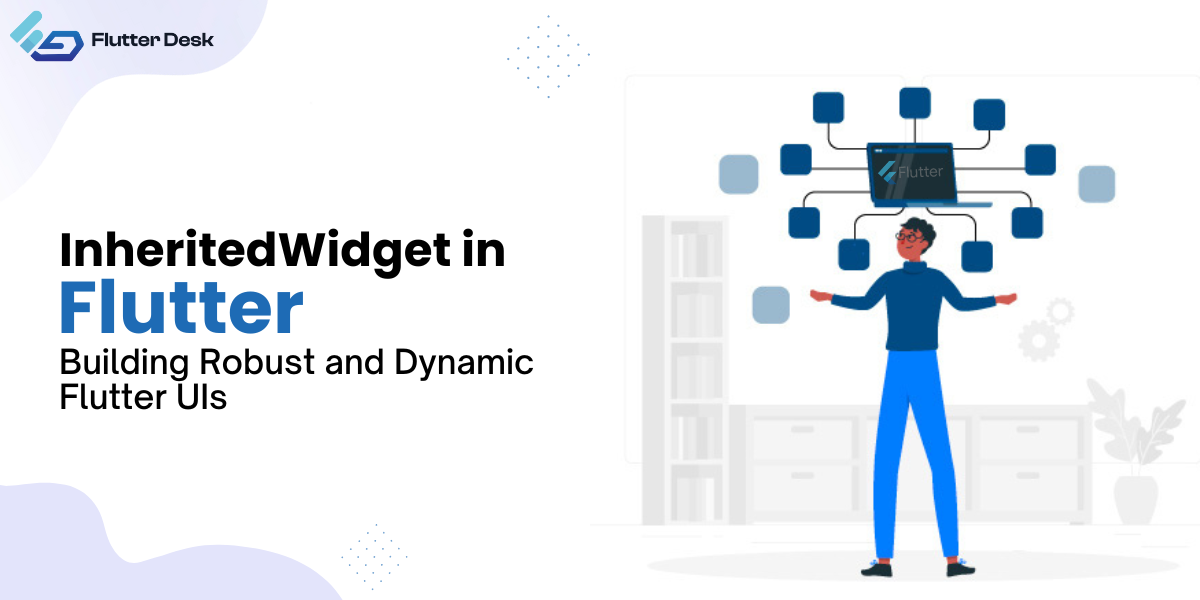
Among the various state management solutions, one that often goes underappreciated is the Inherited Widget. It’s a robust, efficient, and
Have you ever imagined designing a high-performance mobile application from a single codebase? Yes, this is the ease flutter brings

Routing and navigating are the two most common terms in mobile applications. In Flutter, routing refers to switching between the
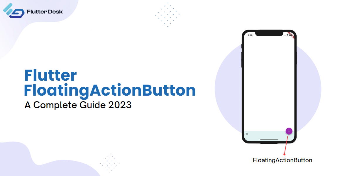
Flutter Floating Action Button (FAB) is a prominent UI element that helps users perform primary actions in an application. FABs

Flutter, a Google native UI toolkit, has overtaken the mobile development world. To get the maximum out of this reliable

Flutter, a robust brainchild of Google, enables you to create natively compiled applications. Out of many other benefits of Flutter,
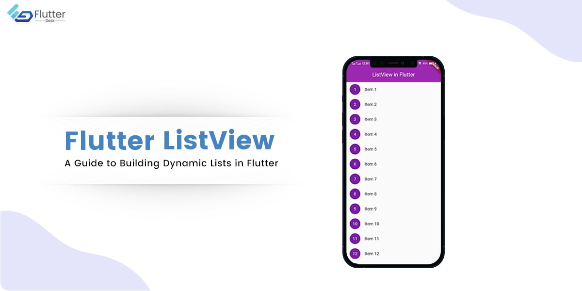
Flutter ListView is a powerful widget that allows you to display a scrollable list of widgets in your app. It

As a Flutter developer, you’re likely familiar with the wide variety of widgets available to create seamless and interactive user
