Flutter Floating Action Button (FAB) is a prominent UI element that helps users perform primary actions in an application. FABs are widely used in mobile apps and are an important part of the Material Design language.
In this article, I will guide you through creating and customizing a FAB and best practices and rules for using it effectively.
How to Create a Flutter Floating Action Button
To create a FAB, we must set up a new Flutter project, add dependencies, and create a FloatingActionButton widget. First, set up a new Flutter project using the Flutter command-line interface. We can do this by running the following command:
flutter create my_app
Next, we must add the necessary dependencies to our `pubspec.yaml` file. We can add the dependencies by using the following code:
floatingActionButton: FloatingActionButton(
  onPressed: () {},
  child: Icon(Icons.add),
),
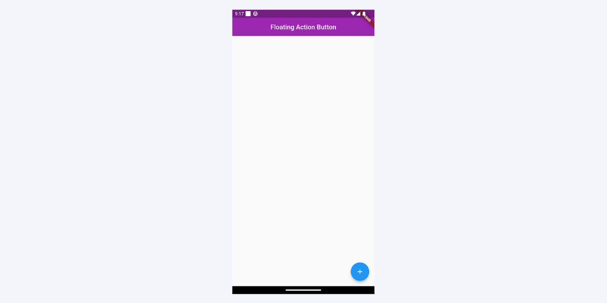
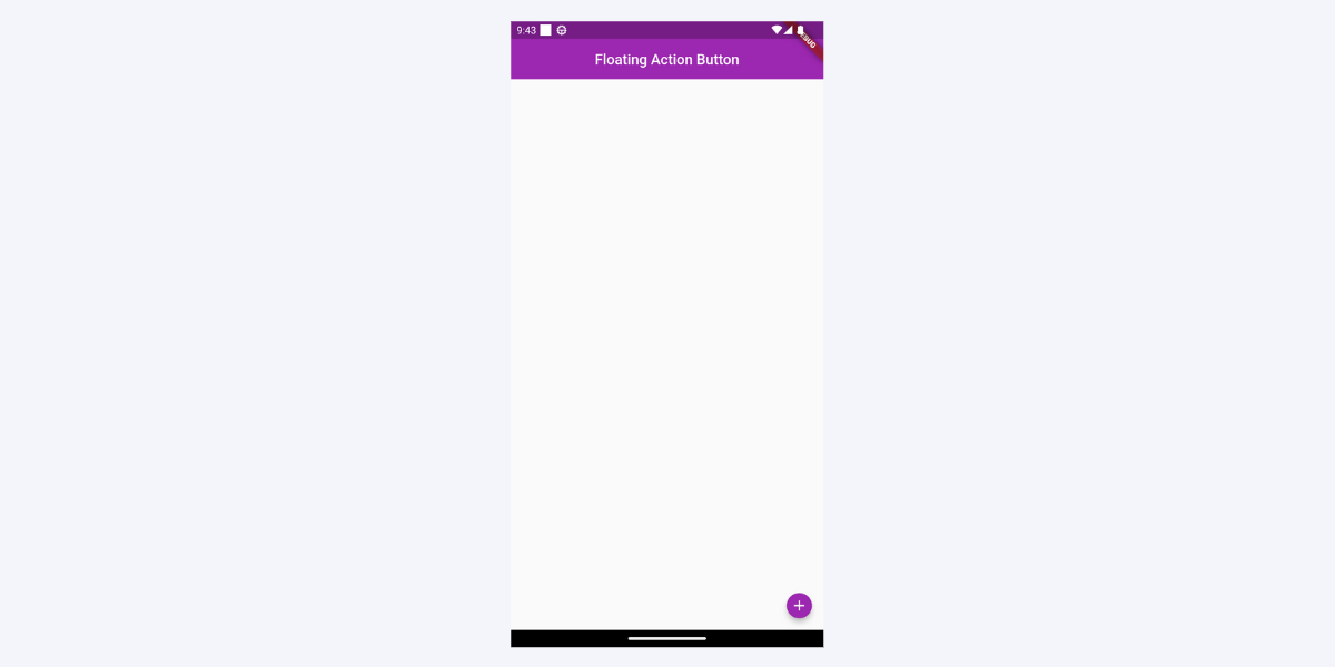
Once we’ve added the dependencies, we can create a FloatingActionButton widget from the Flutter material library using the `FloatingActionButton` class. This creates a basic FAB with a plus icon. We can customize the FAB further by changing its shape, size, and color.
Here is what the floating action button looks like:

Customizing FloatingActionButton
While the default FloatingActionButton (FAB) in Flutter is effective and visually appealing, we can customize it to fit the design of our application. Here are some ways to customize the FAB:
Changing the FAB’s color
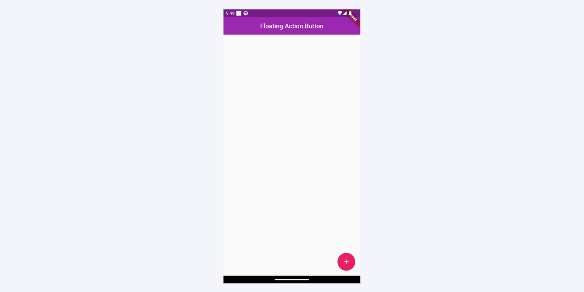
We can change the color of the FAB by using the `backgroundColor` property. This property takes a `Color` object that sets the background color of the FAB.
FloatingActionButton(
  backgroundColor: Colors.blue,
  child: Icon(Icons.add),
  onPressed: () {},
This is how the floating action button looks with the changed color, i.e., blue.
Floating Action Button With Gradient
We can also use a gradient to give the FAB a more dynamic look. For this, we have to wrap it in a `container` and then set the `backgroundColor` of FAB to `Colors.transparent`.
Container(
 height: 60,
 width: 60,
 decoration: const BoxDecoration(
   shape: BoxShape.circle,
   gradient: LinearGradient(
     colors: [Colors.purple, Colors.deepOrange],
   ),
 ),
 child: FloatingActionButton(
   backgroundColor: Colors.transparent,
   child: const Icon(Icons.add),
   onPressed: () {},
 ),
)
This is how the floating action button appears with a change gradient:

Changing the FloatingactionButton’s shape
We can change the shape of the FAB by using the shape property. This property takes a ShapeBorder object that sets the shape of the FAB. We can use different shapes, such as circular or rectangular, to fit the design of our application.
FloatingActionButton(
  shape: RoundedRectangleBorder(
    borderRadius: BorderRadius.circular(10.0),
  ),
  child: Icon(Icons.add),
  onPressed: () {},
),
Below is the added screenshot of the floating action button with a changed shape:

Adding a Hero Tag
When we have multiple FABs on different screens, we can add a hero tag to ensure that the FAB is consistent across screens. The hero tag allows the FAB to transition smoothly when navigating between screens.
FloatingActionButton(
  heroTag: 'CustomTag',
  child: Icon(Icons.add),
  onPressed: () {},
),
How to Change Size of Floating Action Button in Flutter
We can change the size of the FAB by using the `SizedBox` property. This property takes width and height. We can increase or decrease the FAB size to fit our application’s design.
SizedBox(
 width: 35,
 height: 35,
 child: FloatingActionButton(
   onPressed: () {},
   isExtended: true,
   child: const Icon(Icons.add),
 ),
),
You can see the floating action button size been decreased in the added screenshot:
Making Custom FloatingActionButton
To create a custom FAB, you can use the floatingActionButton property of the Scaffold and set it to a `GestureDetector` widget that allows you to add touch gesture detection to any widget. In this case, it wraps a Container widget.
The Container widget defines the appearance of the custom FAB. It has a width and height of 56 pixels, and its decoration property sets the shape to a circle and the color to pink.
import 'package:flutter/material.dart';

void main() => runApp(MyApp());

class MyApp extends StatelessWidget {
  @override
  Widget build(BuildContext context) {
    return MaterialApp(
      title: 'Custom FAB Demo',
      home: Scaffold(
        appBar: AppBar(
          title: Text('Custom FAB Demo'),
        ),
        body: Center(
          child: Text('Press the FAB'),
        ),
        floatingActionButton: GestureDetector(
 onTap: () {},
 child: Container(
   width: 56,
   height: 56,
   decoration: const BoxDecoration(
     shape: BoxShape.circle,
     color: Colors.pink,
   ),
   child: const Icon(
     Icons.add,
     color: Colors.white,
   ),
 ),
),
Here’s an example of a custom FAB with a pink background and a plus icon:
By tapping on the FAB, the empty onTap callback is triggered. You can add your desired functionality within this callback to perform actions when the FAB is pressed.
This code demonstrates how to create a custom FloatingActionButton with a circular shape, a pink background color, and an ‘add’ icon in the center.
Improve Interactivity with Extended FloatingActionButton
The `FloatingActionButton` widget in Flutter also has an extended version that provides additional space for a label and an icon. The `FloatingActionButton.extended` widget allows us to create FABs with longer text labels or more detailed descriptions.
Here’s an example of an extended FAB with a label and an icon:
import 'package:flutter/material.dart';
void main() => runApp(MyApp());
class MyApp extends StatelessWidget {
  @override
  Widget build(BuildContext context) {
    return MaterialApp(
      title: 'Extended FAB Demo',
      home: Scaffold(
        appBar: AppBar(
          title: Text('Extended FAB Demo'),
        ),
        body: Center(
          child: Text('Press the FAB'),
        ),
floatingActionButton: FloatingActionButton.extended(
          label: Text('Add Item'),
          icon: Icon(Icons.add),
          onPressed: () {},
        ),
      ),
    );
  }
}
Below is the added visual of the extended FAB for better interactivity:
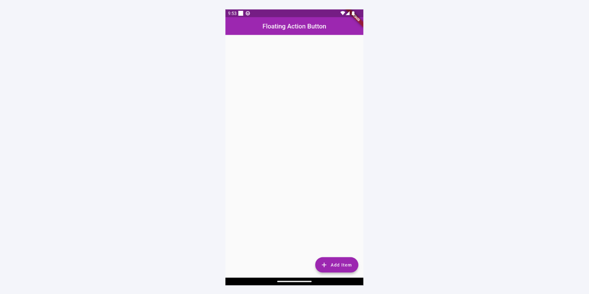
In this example, the `FloatingActionButton.extended` widget creates an extended floating action button with a label, an optional icon, and an onPressed callback to handle button presses. It is commonly used to trigger actions or perform specific tasks in a Flutter application.
Adding Animations and Transitions to FloatingActionButton
In addition to customizing the FloatingActionButton (FAB) appearance, we can add animations and transitions to make the FAB more engaging and interactive for the user. Here are some ways to add animations and transitions to the FAB:
Floating Action Button Motion
We can use the `floatingActionButtonAnimator` property allows you to specify the animation type for the floating action button. In this code example, setting it to `FloatingActionButtonAnimator.scaling` applies a scaling animation to the button, resulting in a smooth growth or shrinkage effect when the button appears or disappears on the screen.
Scaffold(
 appBar: AppBar(title: const Text('Floating Action Button')),
 floatingActionButtonAnimator: FloatingActionButtonAnimator.scaling,
 floatingActionButton: FloatingActionButton(
   onPressed: () {},
   child: const Icon(Icons.add),
 ),
),
Ripple Effect
We can add a ripple effect to the FAB to provide visual feedback to the user when the FAB is pressed.
Scaffold(
  floatingActionButton: FloatingActionButton(
    child: Icon(Icons.add),
    onPressed: () {},
  ),
),
Animation when Transitioning Between Screens
The `FloatingActionButton` widget includes additional properties, `key` and `heroTag`, that can help with animation between screens.
In this case, a `UniqueKey` is generated, which ensures that each instance of the FloatingActionButton has a unique identifier. This can be helpful during animations or when performing widget updates or flutter setstate preservation operations.
The code sets up a `FloatingActionButton` with a `unique key,` a `heroTag` for animations between screens, an empty `onPressed` callback, and an ‘add’ icon. The key property ensures the uniqueness of the widget, while the heroTag property helps create smooth animations when transitioning the FloatingActionButton between screens.
FloatingActionButton(
 key: UniqueKey(),
 heroTag: 'customTag',
 onPressed: () {},
 child: const Icon(Icons.add),
),
Best Practices for Using Flutter Floating Action Button
When it comes to using Flutter Floating Action Button (FAB), there are certain best practices that we need to follow to ensure that our app’s user interface is intuitive and easy to navigate. Here are some guidelines to keep in mind:
- Placement
The placement of the FAB is critical to its functionality. It should be easily accessible to the user and should not obstruct other important UI elements.
It is common to place the FAB in the screen’s lower right-hand corner, as this is where users typically expect to find it. However, it may be appropriate to place the FAB in a different location if it makes more sense for the primary action the FAB is performing.
- Iconography
Choosing the right icon for the FAB is important to ensure users understand what action the button performs. It should indicate the primary action that the FAB performs.
For example, if the FAB is used to add a new item, using a plus sign or an icon of a notepad with a pen may be appropriate. Similarly, if the FAB is used to perform a search, a magnifying glass icon may be used.
- Primary action
The FAB should be used to perform a primary action. It should not be used for secondary or less important actions. The FAB should be reserved for actions the user will likely perform frequently. If the action is not frequently used, placing it in a different location in the UI may be more appropriate.
- Consistency
The FAB should be consistent with the overall design of the application. It should match the color scheme and typography of the app. This means that if the app has a blue and white color scheme, the FAB should also be blue and white. Additionally, the FAB should use the same font if the app uses a specific font.
Modifying Flutter Floating Action Button Position
The default position of the FloatingActionButton (FAB) in Flutter is at the bottom right corner of the screen. However, we can change the FAB position to fit our application’s design. Here are some ways to change the position of the FAB:
Changing the FAB’s Position Using the Scaffold widget
The most common way to change the position of the FAB is to use the floatingActionButton property of the `Scaffold` widget. This property takes a FloatingActionButton widget and positions it at the bottom right corner of the screen by default. However, we can change the position of the FAB by wrapping it inside a `Stack` widget and positioning it wherever we want.
Scaffold(
  floatingActionButton: FloatingActionButton(
    child: Icon(Icons.add),
    onPressed: () {},
  ),
  floatingActionButtonLocation: FloatingActionButtonLocation.centerFloat,
)
You can see the below-added screenshot with FAB being positioned in the middle

In this example, we have changed the position of the FAB to be centered horizontally at the bottom of the screen by using the `floatingActionButtonLocation` property.
Flutter Bottom Navigation Bar With Floating Action Button
Sometimes, we might want a bottom navigation bar and a FAB in our application. In this case, we can combine them by placing the FAB above the bottom navigation bar.
To create a bottom navigation bar with a FAB in Flutter, we can use the `floatingActionButton` and `floatingActionButtonLocation` properties of the `Scaffold` widget. We can set the `floatingActionButtonLocation` to `FloatingActionButtonLocation.centerDocked` to position the FAB above the bottom navigation bar.
import 'package:flutter/material.dart';
void main() => runApp(MyApp());
class MyApp extends StatefulWidget {
 const MyApp({Key? key}) : super(key: key);


 @override
 State createState() => _MyAppState();
}


class _MyAppState extends State<MyApp> {
 int _selectedIndex = 0;


 void _onItemTapped(int index) {
   _selectedIndex = index;
   setState(() {});
 }


 @override
 Widget build(BuildContext context) {
   return MaterialApp(
     title: 'Floating Action Button with Bottom Navigation Bar Demo',
     home: Scaffold(
       appBar: AppBar(
         title: const Text(
           'Floating Action Button with Bottom Navigation Bar Demo',
         ),
       ),
       body: Center(
         child: Text('Selected item: $_selectedIndex'),
       ),
       bottomNavigationBar: BottomAppBar(
         elevation: 0,
         notchMargin: 8,
         color: Colors.transparent,
         clipBehavior: Clip.hardEdge,
         shape: const CircularNotchedRectangle(),
         child: BottomNavigationBar(
           backgroundColor: Colors.grey,
           items: const [
             BottomNavigationBarItem(
               icon: Icon(Icons.home),
               label: 'Home',
             ),
             BottomNavigationBarItem(
               icon: SizedBox(),
               label: '',
             ),
             BottomNavigationBarItem(
               icon: Icon(Icons.person),
               label: 'Profile',
             ),
           ],
           currentIndex: _selectedIndex,
           onTap: _onItemTapped,
         ),
       ),
       floatingActionButton: FloatingActionButton(
         child: const Icon(Icons.add),
         onPressed: () => print('FAB pressed'),
       ),
       floatingActionButtonLocation: FloatingActionButtonLocation.centerDocked,
     ),
   );
 }
}
In this example, we’ve created a bottom navigation bar with three items and a FAB with an “add” icon.
We can handle the taps on the bottom navigation bar items using the onTap callback of the `BottomNavigationBar` widget. We can handle the tap on the FAB using its `onPressed` callback.
Combining a bottom navigation bar is a great way to provide easy access to frequently used actions. In addition, it also allows the user to navigate between different application sections. However, we should use them carefully and ensure the FAB doesn’t interfere with the user’s ability to use the bottom navigation bar.
Conclusion
The Flutter FloatingActionButton widget is a versatile and useful UI element that can enhance the user experience of our app. Whether we’re customizing the appearance of the FAB, positioning it on the screen, or adding animations and transitions, we should always keep the user’s needs and expectations in mind.
With the right approach, we can create FABs that add value and functionality to our app and help us achieve our design goals.
In addition, if you want any other Flutter app development services, you can hire a Flutter developer.