The filter chip in Flutter is a small, compact UI element that allows users to select one or multiple options from a set of choices. We use the Flutter chip widget in applications to enable the filtering of data and the selection of multiple items. In this blog post, we will explore the concept of filter chips in Flutter, their use cases, and the various customizations we can make to them with practical examples.
Let’s first get to know what are chips in Flutter.
What is Filter Chip Widget in Flutter?
Filter chips are small, circular, or rectangular UI elements representing a category, attribute, or filter. You can select or deselect them and the selected options are displayed as active chips. The options represented by the chips are usually predefined, and the user can choose one or multiple options to filter data. The options can be anything from simple values like colors, sizes, or brands to more complex ones like dates, locations, or categories.
Why Use Filter Chips?
Filter chips provide a simple and intuitive way for users to filter data and select multiple options. These chips are helpful in applications that need to filter large amounts of data, such as e-commerce applications, where the user needs to filter products based on various criteria. Moreover, we can also use filter chips in navigation menus, where the user can select different categories or filters to view specific data types.
The compact size of filter chips easily places them in a compact area, making them ideal for mobile applications. Additionally, they provide a visual indication of the selected options, making it easy for users to see the filters they have applied.
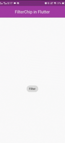
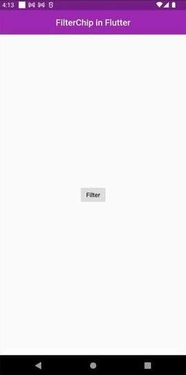
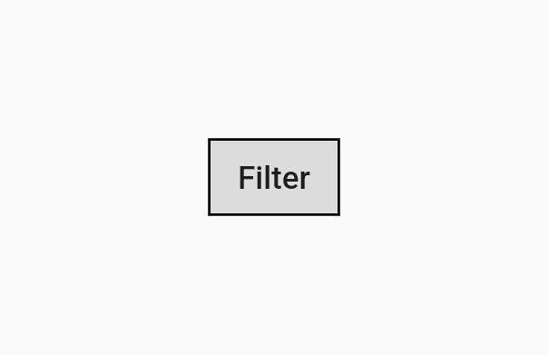
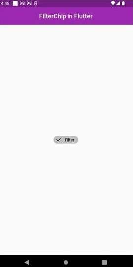
Let’s create a simple chip using the FilterChip widget.
How to Create Filter Chips in Flutter?
To create a chip in Flutter, FillterChip widget. We have created a simple chip with default arguments. You can see the code below.
class HomePage extends StatefulWidget {
  const HomePage({Key? key}) : super(key: key);
  @override
  State<HomePage> createState() => _HomePageState();
}
class _HomePageState extends State<HomePage> {
  var _isSelected = false;
  @override
  Widget build(BuildContext context) {
    return Scaffold(
      appBar: AppBar(title: const Text('FilterChip in Flutter')),
      body: Center(
        child: FilterChip(
          selected: _isSelected,
          label: const Text('Filter'),
          onSelected: (_) {
            _isSelected = _;
            setState(() {});
          },
        ),
      ),
    );
  }
}
Output
Customizing Filter Chip Widget in Flutter
In Flutter, we can customize filter chips in several ways including size, shape, color, and text style. The following are some of the customizations that we can make to filter chips in Flutter.
1. Shape
The shape property can customize the filter chips to be either circular or rectangular. The default shape is circular, but you can create rectangular chips by setting the shape property of the Chip widget to be RoundedRectangleBorder.
Let us customize filter chips using different shape properties of the chip widget.
Here, we are adding border radius to the chip.
@override
  Widget build(BuildContext context) {
    return Scaffold(
      appBar: AppBar(title: const Text('FilterChip in Flutter')),
      body: Center(
        child: FilterChip(
          shape: RoundedRectangleBorder(
            borderRadius: BorderRadius.circular(0),
          ),
          selected: _isSelected,
          label: const Text('Filter'),
          onSelected: (_) {
            _isSelected = _;
            setState(() {});
          },
Output
Now, if you want to assign any color to the border of the chip, you can do that using side: const BorderSide(color command.
See the code and the outputs below.
  @override
  Widget build(BuildContext context) {
    return Scaffold(
      appBar: AppBar(title: const Text('FilterChip in Flutter')),
      body: Center(
        child: FilterChip(
          shape: RoundedRectangleBorder(
            borderRadius: BorderRadius.circular(0),
            side: const BorderSide(color: Colors.black),
          ),
          selected: _isSelected,
          label: const Text('Filter'),
          onSelected: (_) {
            _isSelected = _;
            setState(() {});
          },
Output
As you can see, the filter has a border around it. It has a black color and you can change it to any color using any other color in BorderSide(Color. Colors.black).
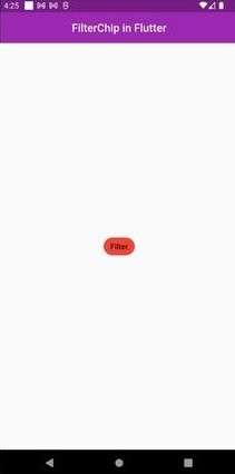
2. Color
We can customize the color of the filter chips to match the overall color scheme of the application. The chips’ backgroundColor property can set the chips’ background color. Similarly, we can change the color of the text using the textStyle property.
Let’s make tweaks to the Flutter chip widget using the color property.
  @override
  Widget build(BuildContext context) {
    return Scaffold(
      appBar: AppBar(title: const Text('FilterChip in Flutter')),
      body: Center(
        child: FilterChip(
          selectedColor: Colors.blue,
          backgroundColor: Colors.red,
          selected: _isSelected,
          label: const Text('Filter'),
          onSelected: (_) {
            _isSelected = _;
            setState(() {});
          },
        ),
      ),
    );
  }
As you can see in the code above, the backgroundColor will be applied when Chip is not selected and selectedColor will be applied when the chip is selected. Here are the results.
Output

3. Elevation
This property of the chip widget holds the double value as it elevates the height of the chip. This forms a shadow under the chip you place anywhere in the app. Let’s see this with the help of an example.
class _HomePageState extends State<HomePage> {
  var _isSelected = false;
  @override
  Widget build(BuildContext context) {
    return Scaffold(
      appBar: AppBar(title: const Text('FilterChip in Flutter')),
      body: Center(
        child: FilterChip(
          elevation: 5,
          selected: _isSelected,
          label: const Text('Filter'),
          onSelected: (_) {
            _isSelected = _;
            setState(() {});
          },
        ),
      ),
    );
  }
}
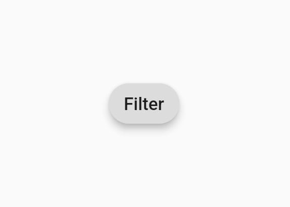
4. Visual Density
The visual density property of the flutter chip widget defines the compactness of a component in the UI. It is a unitless property as it has different tweaks to do with the UI components.
The value range for horizontal and vertical attributes for VisualDensity is between -4 to 4. This means that you can set any value from -4 to 4.
Here, we are assigning both vertical and horizontal values as -4. Let’s see how it looks.
  @override
  Widget build(BuildContext context) {
    return Scaffold(
      appBar: AppBar(title: const Text('FilterChip in Flutter')),
      body: Center(
        child: FilterChip(
          visualDensity: const VisualDensity(vertical: -4, horizontal: -4),
          selected: _isSelected,
          label: const Text('Filter'),
          onSelected: (_) {
            _isSelected = _;
            setState(() {});
          },
        ),
      ),
    );
  }
Output
As you can see, the filter chip has a more compact look than before.
5. Size
We can also customize the size of filter chips by setting the height and width properties. These properties are useful when you need to fit the chips into a specific area or when you want to make the chips larger or smaller to match the design of your application.
6. Text Style
You can customize the text style of the filter chips using the TextStyle property of the FilterChip widget. This property includes changing the font family, size, color, and text weight by using the Flutter template available within the library.
7. labelStyle and checkmarkColor
In Flutter, the label property of a FilterChip widget specifies the text that appears on the chip. It also represents a filter in a UI. Similarly, the labeSyle and checkmarkColor properties of the FilterChip widget are used to customize the appearance of a chip.
The labelStyle property determines the style of the text displayed on the chip. This property can be set to an TextStyle object, which allows you to specify the font size, color, font weight, etc. of the text.
Let’s see an example.
class HomePage extends StatefulWidget {
  const HomePage({Key? key}) : super(key: key);
  @override
  State<HomePage> createState() => _HomePageState();
}
class _HomePageState extends State<HomePage> {
  var _isSelected = false;
  @override
  Widget build(BuildContext context) {
    return Scaffold(
      appBar: AppBar(title: const Text('FilterChip in Flutter')),
      body: Center(
        child: FilterChip(
          labelStyle: const TextStyle(
            color: Colors.blue,
            fontSize: 18,
            fontWeight: FontWeight.w600,
          ),
          checkmarkColor: Colors.blue,
          selected: _isSelected,
          label: const Text('Filter'),
          onSelected: (_) {
            _isSelected = _;
            setState(() {});
          },
        ),
      ),
    );
  }
}
In the above code example, the text displayed on the chip is set to blue and the checkmark that appears when the chip is selected is also set to blue. These properties allow you to customize the appearance of the FilterChip widget to better match your app’s design.
8. On-Press Animation
You can customize the on-press animation of the filter chips to provide feedback to the user when they select or deselect a chip. We can set the on-press animation using the splashColor and highlightColor properties.
All the fuss aside, it’s very important to know the different types of chips in flutter. Here are the types of FilterChips.
Different Types of Chips
In Flutter, there are several types of chips that can be used to create different types of user interface elements:
Action Chip: This type of chip is used to represent a single action that a user can take. When pressed, it triggers a specific action.
Choice Chip: This type of chip is used for selecting one option from a set of choices. The user can select a single choice chip at a time, and the selected chip is displayed with a filled background color.
Filter Chip: As discussed above, we use a filter chip for filtering data. The user can select one or multiple options, and the selected options are displayed as active chips.
Input Chip: An input chip represents a complex piece of information, such as a contact, in a compact form. It can contain text, images, and an avatar.
Chip Theme: This type of chip is used for customizing the appearance of multiple chips in an application. You can use a single-chip theme to apply to all the chips in an application, or multiple-chip themes can be used to create a more customized appearance.
Each type of chip can be customized in terms of size, shape, color, and text style to match the overall design of the application. The different types of chips in Flutter provide a flexible and powerful way to create various types of user interface elements in Flutter applications.
Conclusion
Looking to create filter chips in your Flutter app? Hire Flutter app developers who can help you customize filter chips in many ways, including their size, shape, color, and text style. Filter chips are small, compact UI elements that allow users to filter data and select multiple options. They provide a simple and intuitive way for users to filter data, and their compact size makes them ideal for mobile applications.