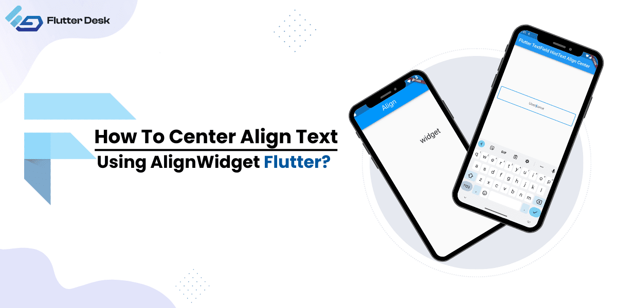
In app design, how you center align text plays a pivotal role, going beyond mere aesthetics to directly influence clarity and user engagement. With Flutter, Google’s acclaimed UI toolkit, achieving the perfect center-aligned text isn’t just possible—it’s straightforward.
Flutter offers many methods for text alignment, from the intuitive TextAlign property to the versatile Align widget and even the adaptable Container and SizedBox widgets. However, with such an array of tools at one’s disposal, it’s easy to feel overwhelmed. Whether you’re a seasoned developer or just starting, this guide aims to unravel the nuances of center-aligning text in Flutter. Dive in with us, and let’s refine your app’s text presentation.
Centre Align Text Using Align Widget
The Align widget, though non-visual, holds a significant role in the Flutter framework. Its primary function? To control the alignment of its child within the available space. This can be especially pivotal when positioning text elements within a layout.
Think of the Align widget as a director, guiding its child (in our case, text) to its proper spot on the stage.
Parameters of the Alignment Child Widget
Every widget in Flutter can be considered to have “settings” that determine how it behaves. For the Align widget, these settings come in the form of parameters. The most fundamental of these parameters is the alignment property.
The alignment property dictates where the child widget, often text, will be placed. It works in tandem with an Alignment object with x and y values ranging from -1 to 1. For instance:
- Alignment(0.0, 0.0) corresponds to the center of the screen.
- Alignment(-1.0, -1.0) would represent the top-left corner.
Understanding these parameters is crucial. They offer the granular control developers often seek, ensuring text is aligned and pixel-perfect in its positioning.
Text Align Property
One of the simplest ways to manipulate text alignment in Flutter is by using the TextAlign property. This property allows developers to position text relative to its container, offering straightforward solutions for everyday alignment needs.
Flutter Text Alignment Left
When you aim to align your text to the left side of its container, the TextAlign property is your go-to. Using it is as straightforward as:
Text(
  'Align me to the left!',
  textAlign: TextAlign.left,
)
This will ensure that the text begins at the leftmost edge of its container.
Flutter Text Alignment Right
Aligning text to the right can be vital for specific design considerations or languages that read right-to-left. To achieve this:
Text(
  'Align me to the right!',
  textAlign: TextAlign.right,
)
This snippet positions the text at the rightmost edge of its containing widget.
Flutter Center Text Horizontally
For situations where you want your text to be the star of the show, centering it horizontally can add emphasis. Here’s how:
Text(
  'I am centered horizontally!',
  textAlign: TextAlign.center,
)
With this, your text finds its place right in the horizontal middle of its container.
Flutter Center Text Vertically
While TextAlign predominantly affects horizontal alignment, vertically centering text often involves parent widgets. But for the sake of continuity, here’s a common approach using the Center widget:
Center(
  child: Text('I am centered vertically!'),
)
By wrapping your text in a Center widget, it will position itself in the vertical middle of its parent container. The TextAlign property is a foundational tool in any Flutter developer’s arsenal, offering quick and efficient solutions to common text alignment challenges.
Exploring Other Alignment Widgets
While Flutter’s TextAlign property offers a direct approach to text alignment, the framework also boasts a variety of widgets tailored for specific use cases. Delving into these widgets reveals the flexibility and power Flutter puts in developers’ hands.
Text Align Center using SizedBox Widget
The SizedBox widget in Flutter is often recognized for its capability to give fixed dimensions to its children. However, it also applies to text alignment, especially when looking to center-align text with specified constraints.
SizedBox(
  width: 200,
  height: 100,
  child: Center(
    child: Text('Centered within constraints'),
  ),
)
The text is centered within a box of 200×100 units in the above snippet.
Use Cases And Benefits
- Constrained Alignment: When your design requires text to be centered within certain boundaries, SizedBox combined with Center works wonders.
- Predictability: SizedBox provides a predictable space, ensuring your text remains centered irrespective of screen sizes and resolutions.
Text Align Center Using Center Widget
As its name suggests, the Center widget is built explicitly for centering its child widget. It’s a straightforward, no-frills approach to achieving dead-center alignment.
Center(
  child: Text('Perfectly centered text'),
)
By wrapping the Text widget with Center, you ensure it sits smack dab in the middle of its parent container.
How It Differs From Other Alignment Methods
Unlike TextAlign, which primarily focuses on horizontal alignment within the Text widget’s constraints, the Center widget works with its child’s parent container, centering the child horizontally and vertically. It offers a more holistic centering solution compared to other alignment methods.
Align Text in Flutter using Container Widget
The container is Flutter’s Swiss Army knife, a versatile widget that combines painting, positioning, and sizing. It provides developers many options to design and align content, making it a favorite in many Flutter applications.
How To Use Alignment Inside A Container
Within the Container widget, the alignment property comes into play. This property aligns the child within the container and offers granular control over text positioning when paired with an Alignment object.
Container(
  width: 300,
  height: 300,
  color: Colors.blue,
  alignment: Alignment.center,
  child: Text('Centered text in a blue box'),
)
The text will be centered within a 300×300 blue box in this example. By changing the Alignment object values, developers can place the text anywhere within the container, showcasing the sheer versatility of the Container widget. While varied in their applications, these alignment widgets ensure that Flutter developers have all the tools they need to align text precisely, no matter the design requirements.
How to Use the CrossAxisAlignment Property
CrossAxisAlignment is a property that often finds its relevance in Flutter’s Flex-based layout widgets, namely Column and Row. In text alignment, this property can be an essential tool for aligning text widgets vertically within a Column or horizontally within a Row.
CrossAxisAlignment dictates how children should be aligned perpendicular to the central axis. For Column, it aligns children horizontally, and for Row, it aligns them vertically.
Key Values of CrossAxisAlignment
- CrossAxisAlignment.start: Aligns the children at the start of the column’s width or row’s height.
- CrossAxisAlignment.end: Aligns the children at the end of the column’s width or row’s height.
- CrossAxisAlignment.center: Aligns the children at the center of the column’s width or row’s height.
- CrossAxisAlignment.stretch: Stretches the children across the entire column width or height of the row.
- CrossAxisAlignment.baseline: Aligns the children by their character baselines. This is particularly useful for aligning text of different font sizes by their baseline.
Main Axis Alignment in Flutter
The main axis of a Flex layout (like a Row or Column) is the primary direction in which the children are laid out. For a Row, it’s horizontal; for a Column, it’s vertical. The MainAxisAlignment property determines how the children are spaced out along this main axis.
Row(
  mainAxisAlignment: MainAxisAlignment.spaceEvenly,
  children: <Widget>[
    Text('First'),
    Text('Second'),
    Text('Third')
  ],
)
In this Row example, the text widgets are spaced evenly across the row’s central axis, providing equal spacing between each text.
Key Values of MainAxisAlignment
- MainAxisAlignment.start: Places all children at the start of the row or column.
- MainAxisAlignment.end: Places all children at the end of the row or column.
- MainAxisAlignment.center: Centers all children within the row or column.
- MainAxisAlignment.spaceAround: Places an equal amount of space before, between, and after each child.
- MainAxisAlignment.spaceEvenly: Distributes children evenly, ensuring the space between any two children and the space from the ends is equal.
- MainAxisAlignment.spaceBetween: Maximizes the space between children, pushing them toward the start and end.
By mastering CrossAxisAlignment and MainAxisAlignment, developers can exercise intricate control over text positioning within flex layouts, resulting in more refined and well-aligned UI designs.
Tips for Effective Text Alignment in Flutter
- Context Matters: Before you decide on text alignment, consider the context. For instance, titles and headings might benefit from center alignment for emphasis, while body text is typically left-aligned for better readability.
- Consistency is Key: Ensure you maintain consistent alignment patterns throughout your app. This provides a cohesive user experience.
- Respect Margins and Padding: Text too close to an edge or another element can feel cramped. Make sure there’s enough spacing to let your text breathe.
- Account for Language: Remember that some languages, like Arabic and Hebrew, are read from right to left. Ensure that your alignment choices respect the language of your content.
- Test on Different Devices: Screen sizes and resolutions can impact how your text is displayed. Always test on various devices to ensure consistent alignment.
Common Mistakes We Do With Text Alignment In Flutter
- Overusing Center Text Alignment: While it is suitable for placing headers, overuse of center alignment can impair user readability.
- Ignoring Text-overflow: In Flutter, if a Text widget exceeds its container, it might overflow. Always be mindful of this, and ensure you handle text overflow using the overflow property.
- Not adapting to screen orientations: Sometimes, the center alignment might look good in portrait mode but look off in landscape orientation. So, be sure that your alignment looks good in all possible directions.
- Using fixed dimensions: Don’t be fixed with the dimension however, it might be necessary to create consistency, but it should also work well with the screen orientation. So, go with the dimension that retains user readability and fits all screen dimensions.
Conclusion
Perfecting text alignment in Flutter might require attention to detail, but the outcome is worthwhile. Proper alignment not only ensures that your app looks professional but also guarantees that users have a seamless reading experience. By considering the considerations and avoiding common pitfalls, developers can craft UIs that are functional and aesthetically pleasing. Remember, at the end of the day, alignment isn’t just about aesthetics; it’s a crucial part of UI/UX design.


