Info

Mastering Dismissible in Flutter: Unlock the Power of Swipe Gestures

Have you ever used a smartphone and could swipe away or dismiss certain items on the screen? In Flutter, a powerful Dismissible widget lets you do just that in your app. It’s like giving your users the superpower of swiping away items with a simple touch! With much applause, people still need clarification on what precisely dismissible features are offered in widgets. We hope this article will assist you in the best possible way. What is Dismissible in the Flutter App? In simple terms, dismissible is the widget in Flutter that enables you to add swipe gestures within your application. It’s commonly used to build features like swiping to delete or archive items, similar to what you see in email or to-do list apps. It allows the user to detect swipe gestures and perform actions accordingly. When a user swipes an item, the dismissible widget flutter takes care of the animation for you. It smoothly slides the item off the screen, giving users satisfying visual feedback. You can customize the animation by providing optional parameters like background, secondaryBackground, and direction. How Does Dismissible Work? To use Dismissible, you wrap it around the widget representing each item in your list. This can be any Flutter widget, such as ListTile, Card, or Container. Dismissible takes a few required parameters, including key and child. Key: Helps Flutter keep track of each item in the list uniquely. Child: Represents the widget that users will swipe to dismiss. onDismissed: Defines what happens when an item is swiped away. ( and it is an optional parameter ) Customizing Dismissible In Flutter Customizing Background: When using Dismissible in Flutter, you can customize the background behind the item as it’s being swiped from Left to Right. This background widget typically indicates that the item will be deleted or archived. How to customize the background dismiss in Flutter?  To customize the background, you can utilize the background parameter of the Dismissible widget. This parameter accepts a widget of your choice, allowing you to design and style it to fit your app’s theme. You can use containers, images, icons, or any other widget to create the desired visual effect. Customizing Secondary Background In addition to the main background, Dismissible also allows you to specify a secondary background. This background appears when swiping the item in the Right to Left direction. It’s helpful to provide different actions based on the swipe direction. How to specify secondary background? To customize the secondary background, you can use the secondaryBackground parameter of the Dismissible widget. Like the background, this parameter accepts a widget that you can design and style to your liking. A code example to show how you can customize background and secondaryBackground Dismissible( key: UniqueKey(), background: Container( width: double.infinity, color: Colors.red, height: 100, ), secondaryBackground: Container( width: double.infinity, color: Colors.yellow, height: 100, ), child: const ListTile( title: Text(‘Dismissible’), trailing: Icon(Icons.add), ), ) Here is the visual representation of  how the code works: Customizing Direction By default, Dismissible in Flutter supports both left-to-right and right-to-left swipes. However, there may be cases where you want to limit the swipe direction to a specific orientation. How to limit swipe direction to a specific direction in Flutter? To limit the swipe direction, you can use the direction parameter of the Dismissible widget. This parameter takes a DismissDirection enum value, which allows you to specify the allowed swipe direction. Utilizing these customization options allows you to create visually appealing and interactive swipe actions in your Flutter app. Customizing the background and secondaryBackground allows you to match your app’s design and provides clear indications of the actions users can take. Also Read –  Flutter gesturedetector mastering gestures guide How to disable swiping in the dismissible widget in Flutter? To disable swiping in a Dismissible widget in Flutter, set the direction parameter to DismissDirection.none. With DismissDirection.none, the Dismissible widget won’t respond to swipe gestures, effectively disabling swiping in both left-to-right and right-to-left directions. To disable swiping from right to left (start to end): Dismissible( // other parameters… direction: DismissDirection.endToStart, // Disable swiping from right to left // child and onDismissed… ) To disable swiping from left to right (end to start): Dismissible( // other parameters… direction: DismissDirection.startToEnd, // Disable swiping from left to right // child and onDismissed… ) 5 Advantages of Dismissible Widget in Flutter Prevent accidental dismissals: A confirmDismiss parameter in Dismissible allows you to ask the user for approval before completing the dismissal action, which helps to avoid unintentional dismissals. This helps add an extra degree of security for users and helps prevent unintentional dismissals. Flexibility and Versatility: Dismissible can be used with various widgets, such as ListTile, Card, or Container, allowing you to incorporate swipe-to-dismiss functionality. Whether it’s a list of messages, tasks, or any other type of item, Dismissible can adapt to different scenarios and use cases. Enhanced User Experience: Dismissible allows users to interact with your app through intuitive swipe gestures, making the user experience more engaging and interactive. Simplified Implementation: Dismissible simplifies adding swipe gestures to your app. With just a few parameters and callbacks, you can enable swipe-to-dismiss functionality for individual list items or widgets without implementing complex gesture recognition logic from scratch. Animation Support: Dismissible includes built-in animations that smoothly slide the item off the screen when dismissed. Conclusion Using the Dismissible widget in Flutter enhances the user experience, simplifies implementation, provides customizable swipe actions, supports animations, offers flexibility, and promotes code reusability. It empowers developers to create user-friendly and interactive apps with swipe-to-dismiss functionality. If you are a beginner and want a more intuitive app experience, you can hire Flutter developers to get an expert at your desk.  

Read More »

InheritedWidget in Flutter: Building Robust and Dynamic Flutter UIs

Among the various state management solutions, one that often goes underappreciated is the Inherited Widget. It’s a robust, efficient, and flexible technique, largely built into the Flutter framework. InheritedWidget in Flutter is a special widget designed to propagate information down the widget tree efficiently. Besides provider and flutter riverport, getting a deep understanding of what an inherited widget is and how to use the inherited widget in Flutter is very crucial at the Developer’s end to create complex UIs. Let’s get started with it. What is an Inherited Widget in Flutter? Inherited Widgets are a vital component of Flutter’s Widget system, providing a powerful and efficient way of passing data down the tree. The fundamental idea behind InheritedWidget is to provide a way to access data from a parent widget to one or more descendant widgets without passing the state down through constructor parameters. It leverage dart’s object-oriented capabilities and Flutter’s reactive UI updates to create a flexible, intuitive, and performant state management system. How to Use Inherited Widget Flutter Example Inherited Widgets create a data layer their descendants can access via their context. The data isn’t stored in the Inherited Widget itself but in a separate model class that the Inherited Widget takes as a parameter. First, we’ll create our InheritedWidget: ThemeColor is an InheritedWidget with a color property in this snippet. class ThemeColor extends InheritedWidget { final Color color; const ThemeColor({Key? key, required this.color, required Widget child}) : super(child: child, key: key); @override bool updateShouldNotify(ThemeColor oldWidget) { return color != oldWidget.color; } static ThemeColor? of(BuildContext context) { return context.dependOnInheritedWidgetOfExactType<ThemeColor>(); } } Next, we’ll create the widget: that uses this ThemeColor: In this Box widget, we are accessing the color from our ThemeColor InheritedWidget and applying it to the Container. class Box extends StatelessWidget { const Box({super.key}); @override Widget build(BuildContext context) { final color = ThemeColor.of(context)?.color ?? Colors.black; return Container( width: 100, height: 100, color: color, ); } } Now, we use these widgets in our main application: In the below snippet, we’re wrapping our Scaffold with the ThemeColor InheritedWidget and setting the color to Colors.red. Then, within the Box widget, we access the ThemeColor InheritedWidget and apply the color to our box. void main() => runApp(MyApp()); class MyApp extends StatelessWidget { const MyApp({Key? key}) : super(key: key); @override Widget build(BuildContext context) { return MaterialApp( home: ThemeColor( color: Colors.red, child: Scaffold( appBar: AppBar(), body: const Center(child: Box()), ), ), ); } } This is a simple example of how to use InheritedWidget to pass down data (in this case, a color) to descendant widgets in Flutter. Inherited Widget Vs. Provider Features  Inherited Widget Flutter  Complexity Complex Simple State Managment Propagates Data Handles State changes and listener Notifications Multi Provider Capability No Built-in. Have to Set it Manually Has ‘multi provider’ widget Lifecycle Management Manual Built-in Performance Good Optimized What is the Difference Between InheritedWidget and Inherited Model? InheritedWidget and InheritedModel are Flutter classes that propagate information down the widget tree. However, they have a key difference in determining when to notify dependents of changes. When an InheritedWidget changes, based on its updateShouldNotify method, it will notify all dependent widgets in the tree, and those widgets will rebuild. Whereas the InheritedModel will only notify those dependent widgets related to the changed aspects, leading to potentially fewer widget rebuilds. Flutter InheritedWidget with ChangeNotifier ChangeNotifier is a class provided by Flutter that can be used with InheritedWidget to manage the state. It provides a way to listen for changes to a model and allows all listeners (typically widgets) to update their state accordingly. An InheritedWidget provides a way to share data across the widget tree, and a ChangeNotifier provides a way to listen for changes to that data. They can help efficiently manage and respond to changes in your application’s state when used together. 👉 Inkwell flutter widget Example: How to Use ChangeNotifier with InheritedWidget Let’s define a simple ChangeNotifier: In the Counter class mentioned below, notifyListeners() is called whenever the count changes. This will trigger any listeners of this ChangeNotifier to rebuild. class Counter with ChangeNotifier { int _count = 0; int get count => _count; void increment() { _count++; notifyListeners(); } } Now, let’s create our InheritedNotifier: Here, InheritedNotifier is a specialized kind of InheritedWidget that works well with ChangeNotifier. It automatically calls updateShouldNotify when the ChangeNotifier calls notifyListeners, causing the widgets listening to this InheritedNotifier to rebuild. class CounterInheritedNotifier extends InheritedNotifier<Counter> { const CounterInheritedNotifier({ super.key, required Widget child, required Counter notifier, }) : super(child: child, notifier: notifier); static CounterInheritedNotifier? of(BuildContext context) { return context .dependOnInheritedWidgetOfExactType<CounterInheritedNotifier>(); } } Finally, you could use your CounterInheritedNotifier in your widget tree like this: Counter _counter = Counter(); CounterInheritedNotifier( notifier: _counter, child: YourWidgetTree(), ); Then in any descendant widget, you could access the counter and increment it like this: final counterInheritedNotifier = CounterInheritedNotifier.of(context); final counter = counterInheritedNotifier?.notifier; final count = counter?.count ?? 0; ElevatedButton( onPressed: counter?.increment, child: const Text(‘Increment’), ) In this setup, when you call the counter.increment, it updates the count and then calls notifyListeners, triggering updateShouldNotify in the InheritedNotifier, causing all widgets to listen to the InheritedNotifier to rebuild. Here is a visual representation of the above-mentioned code: 3 Key Features of Flutter Inherited Widget You might be aware of the common technicalities; the following are some ways where you could increase the efficiency of the inherited widget Automatic Rebuilds If the inherited data changes, InheritedWidget will immediately rebuild dependent widgets. Because of this, updating the UI in response to changes in the shared state is simple and doesn’t need manually handle state dependencies and trigger updates. The UI will accurately reflect the most recent state of the application since the widgets that rely on the inherited data will be effectively regenerated. Ancestor Access It is another hidden gem that can aid with more advanced use cases. Widgets can access their ancestor Inherited Widgets to retrieve data. This feature can be handy when dealing with nested data models or scoped themes. Querying Multiple Inherited Widgets While Inherited Widgets are great for

Read More »

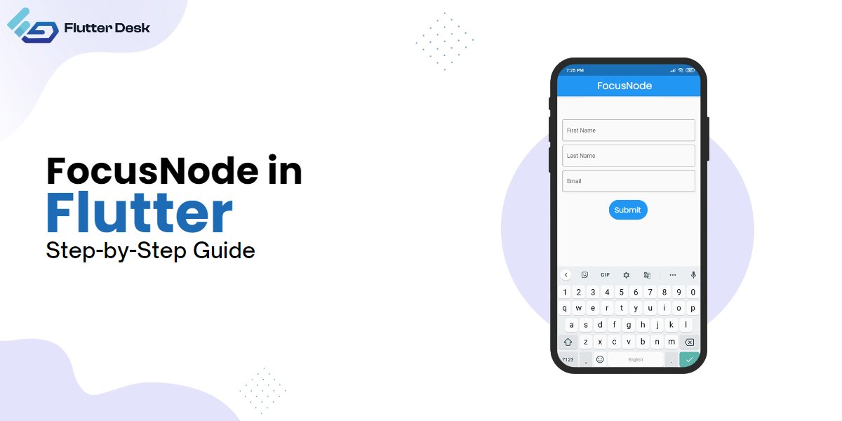
FocusNode in Flutter: Step-by-Step Guide

Have you ever imagined designing a high-performance mobile application from a single codebase? Yes, this is the ease flutter brings you at your fingertips. All this has made Flutter a new app development trend. Now with the endless capabilities of Flutter, the Focus node in Flutter is another helpful tool that enhances the quality of user interaction. Let’s have a closer look at what FocusNode is in Flutter and what its significance is. What is FocusNode in Flutter? FocusNode is an object in Flutter that determines whether a widget is currently in ‘focus’ or not. The widget being in focus means that the widget is presently up for receiving user input. You can imagine focusNode as a spotlight on stage that highlights or focuses on the part of the application your user is currently interacting with. A classic example of this would be a form with multiple text fields. The’ focus’ moves from one text field to another as the user taps or clicks on different areas to enter information. Behind the scenes, FocusNode is managing this interaction. What is FocusNode Used For: FocusNode Flutter Example Where the primary role of focusNode is to manage the widget’s focus, there are other pronounced roles too. One of the prominent uses of FocusNode is to handle keyboard events. FocusNode can control navigation through form fields, such as moving to the next field when the user presses the “Tab” key. This is achieved using the FocusScope widget, which allows you to group a collection of FocusNodes together and manage them as a unit. In addition, FocusNode also handles focus transversal, which means you can programmatically move the focus from one widget to another while managing multiple input fields. Other uses of focusNode in Flutter include: FocusNode has a listener (add-listener callback) that notifies each time the focus state changes. It also enhances application accessibility. How to Use FocusNode with the TextField?    To use the FocusNode, the first thing we need to do is to make an object of FocusNode. Here is ‘myFocusNode,’ for instance. final myFocusNode = FocusNode(); After creating the object of ‘FocusNode’ now, it’s time to assign it to a ‘TextField’ widget via the ‘focusNode’ parameter. In this snippet, we have instructed the ‘TextField’ widget to utilize ‘myfocusNode’ to manage its focus state. TextField( focusNode: myFocusNode, ), We can programmatically also request focus for the ‘TextField’ with the ‘requestFocus()” method. myFocusNode.requestFocus(); By invoking myFocusNode.requestFocus(), we’re asking the Flutter framework to shift the focus to the TextField widget associated with myFocusNode. How to enable focus on the first TextFormField as an application starts or gets visible? The process of enabling focuses on the TextFormField the process goes the same as stated above. But there is only one step you have to make sure to get the desired result. To ensure the TextFormField receives focus as soon as the application starts or the widget becomes visible, you should call requestFocus inside WidgetsBinding.instance.addPostFrameCallback.  @override void initState() { super.initState(); // Request focus on the TextFormField as soon as the UI finishes building WidgetsBinding.instance.addPostFrameCallback((_){ myFocusNode.requestFocus(); }); } What’s happening here is that as soon as Flutter finishes rendering the frame (i.e., UI), it will call our callback method, and in that, we request focus for myFocusNode. And that’s it! With these steps, you’ve set up your application to focus on a specific TextFormField as soon as it starts. How to Pass Focus to the Next TextFormField When the Button is Tapped? The best way to move focus to the next text field is the focusNode.nextFocus() method. The best thing about this method is that you do not have to handle the ‘focusNodes’. Here is the way to do it: Creating two instances of focusNode, one for the email field and the other one for the password field The border method returns a customized InputBorder object for the input field decoration. It creates a rounded border with a gray color and a width of 1. The inputDecoration method returns an InputDecoration object for the input fields with the provided hint text and uses the border method for the border styling.  The initState method is overridden to perform initialization tasks when the widget’s state is created. In this case, it adds a post-frame callback using WidgetsBinding.instance.addPostFrameCallback to request focus on the email input field after the frame has been rendered. We Create 2 TextFormField and assign FocusNode. The first text Field uses the emailFocusNode, and Second Text Filed Uses the passwordFocusNode. We set textInputAction( KeyBoard Action ) to the next for the First Text Field. For the Second Text Field, we set textInputAction ( KeyBoard Action ) to do In the first TextFormField’s onFieldSubmiited method, we request the focus for the password’s TextFormField using FocusScope. FocusScope.of(context).requestFocus(passwordFocusNode); This will automatically transfer the focus to passwordTextField when it gets executed. import ‘package:flutter/material.dart’; class HomePage extends StatefulWidget { const HomePage({Key? key}) : super(key: key); @override State<HomePage> createState() => _HomePageState(); } class _HomePageState extends State<HomePage> { final emailFocusNode = FocusNode(); final passwordFocusNode = FocusNode(); InputBorder get border { return OutlineInputBorder( borderRadius: BorderRadius.circular(16), borderSide: const BorderSide(color: Colors.grey, width: 1), ); } InputDecoration inputDecoration(String hint) { return InputDecoration( hintText: hint, border: border, enabledBorder: border, focusedBorder: border, ); } @override void initState() { super.initState(); WidgetsBinding.instance.addPostFrameCallback((_) { emailFocusNode.requestFocus(); }); } @override Widget build(BuildContext context) { return Scaffold( appBar: AppBar( centerTitle: true, title: const Text( ‘FocusNode in Flutter’, style: TextStyle(color: Colors.white), ), backgroundColor: Colors.purple, ), body: Padding( padding: const EdgeInsets.all(8.0), child: Center( child: Column(mainAxisAlignment: MainAxisAlignment.center, children: [ TextFormField( focusNode: emailFocusNode, decoration: inputDecoration(‘Email’), textInputAction: TextInputAction.next, onFieldSubmitted: (_) { FocusScope.of(context).requestFocus(passwordFocusNode); }, ), const SizedBox(height: 4), TextFormField( focusNode: passwordFocusNode, decoration: inputDecoration(‘Password’), textInputAction: TextInputAction.done, ), ]), ), ), ); } } Here is a visual representation of the above-mentioned code: Other Callbacks From TextField There are several valuable and effective callbacks from the textField in focusNode. The following are the most common: On-changed  Called each time the text contained within the TextField is changed. Helpful in implementing live search, form validation, etc. On-submitted  Called when the user indicates they have

Read More »

Routing and Navigation in Flutter App: Routing Made Easy

Routing and navigating are the two most common terms in mobile applications. In Flutter, routing refers to switching between the pages or screens within the application.  It is crucial to the performance as it directly influences the user experience. This article will briefly guide Flutter navigation and routing and how to use them in Flutter. What is Routing in Flutter? Routing is navigating between different pages within an application. Just as you need a map to navigate a city, you need a routing system to guide users through your app. Routing is managed through the Navigator class, part of the WidgetsApp class, typically provided by either the MaterialApp or CupertinoApp widget. The Navigator manages routes using a stack (Last In, First Out – LIFO). This means the new route is pushed to the stack when you navigate a new page. When you want to return, the current route is popped off the stack to reveal the previous one. Why Do We Use the Route in Flutter? We use routes in Flutter to navigate between different screens or pages in an application. It’s essential for providing a logical flow and maintaining the flutter setstate when moving from one screen to another. It enables users to return to their previous screens and pass data between screens. Flutter Navigator The Navigator is a Flutter widget that controls managing a stack of Route objects and facilitates screen switching. You may think of it as a data structure stack where you can push new routes onto it and pop existing ones off of it. To navigate to a new screen, you can use the Navigator.push() method. This method pushes a new route onto the stack and transitions to it. Navigator.push( context, MaterialPageRoute(builder: (context) => SecondScreen()), ); How To Do Routing in Flutter There are mainly two main methods of routing in Flutter: Basic (or Stack) Routing and Named Routing. Let’s delve into both types in more detail: Stack Routing (basic) Stack routing, or basic routing as it’s sometimes known, is the most straightforward approach to navigation in Flutter. This involves using Navigator’s push and pop methods to add or remove routes (screens) from the stack. Push: When you want to navigate from one screen to another, you “push” a route to the Navigator’s stack. This new route becomes active, and its associated screen is displayed. Here’s an example: Navigator. push( context, MaterialPageRoute(builder: (context) => NewScreen()), ); In this example, MaterialPageRoute is a route that uses a platform-adaptive transition. It’s common in Android and iOS applications. Pop: you have to “pop” the current route from the Navigator’s stack in case you want to return to the previous screen and dismiss the current one.  Here’s how you can do it: Navigator.pop(context); When you call ‘pop,’ the topmost item, i.e., the stack’s current route, gets removed, and the previous becomes active again. Named Routing It is another form of navigation that makes it easier to manage routes in larger applications. Named routing allows you to refer to your routes using predefined string identifiers (or ‘names’) rather than directly dealing with the routes themselves. In named routing, navigation becomes a matter of calling ‘Navigator.pushNamed( )’, passing the name of the route you want to navigate. For example, to navigate to the details screen, you’d do the following: Navigator.pushNamed(context, ‘/details’); And to go back to the previous screen, you need to pop the current route, just like with basic routing: Navigator.pop(context); Passing Arguments to Named Routes In a Flutter application, sometimes you want to share data from one screen to another. This is often referred to as “passing arguments” to a route. Here is what you can do: Define your routes First, you need to tell Flutter about your “routes.” Each route needs a name. We do this in the ‘MaterialApp’ widget. Here, we have two routes(or screens): a HomeScreen and a ‘DetailScreen.’ MaterialApp( initialRoute: ‘/’, routes: { ‘/’: (context) => HomeScreen(), ‘/details’: (context) => DetailScreen(), }, ); Navigate and Pass Arguments If you want to go to the details route using the named route, send some data there, i.e., ‘Hello from HomeScreen!’. You can do this: Navigator.pushNamed( context, ‘/details’, arguments: ‘Hello from HomeScreen!’, ); Receive the Arguments In the DetailScreen, you can accept and use what you brought or sent from the previous screen: class DetailScreen extends StatelessWidget { const DetailScreen({super.key}); @override Widget build(BuildContext context) { // Accept what you brought final String message = ModalRoute.of(context)!.settings.arguments as String; // Use it in your room (or screen) return Scaffold( appBar: AppBar(title: const Text(‘Detail Screen’)), body: Center(child: Text(message)), ); } } So, that’s it! You’re now able to pass arguments to named routes in Flutter. You’ve learned to bring something when navigating from one screen to another. Enjoy! Which Routing is Best in Flutter You must have the right flutter router package in place to get the maximum out of flutter. Following are some top routing packages at your service: Auto-route: This package provides a strongly typed routing setup, which helps avoid errors and improves code readability. It also supports route guards, path parameters, and much more. Go-router:  Go-Router is a declarative routing package for Flutter that simplifies screen navigation using URLs. It allows you to handle deep links and manage various navigation scenarios in your app. It provides a convenient and straightforward API for navigating different screens based on URLs. Shelf-router: Shelf is a modular, middleware-based web server framework for Dart programming language. It allows you to define routes for your Shelf application in a way similar to how you would do it in an Express application for Node.js. flutter_modular: A modular and easy-to-use package for routing. It also provides dependency injection and is widely used for large applications. Best Flutter Routing Package: Flutter Developer’s Choice As per the developer’s community, ’go_router’  is the most efficient package with advanced routing capabilities. It supports both Material and Cupertino apps. go_router  can display multiple screens (sub-routes) for the destination.   It also provides redirection support which means you can re-direct the user

Read More »

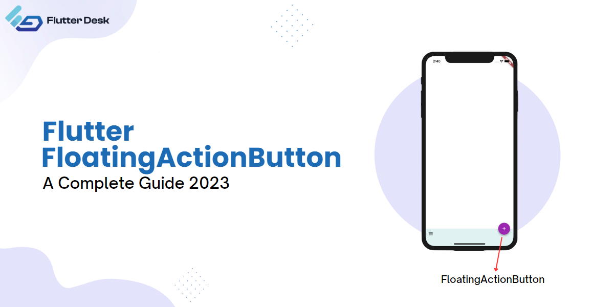
Flutter Floating Action Button: A Complete Guide 2023

Flutter Floating Action Button (FAB) is a prominent UI element that helps users perform primary actions in an application. FABs are widely used in mobile apps and are an important part of the Material Design language. In this article, I will guide you through creating and customizing a FAB and best practices and rules for using it effectively. How to Create a Flutter Floating Action Button To create a FAB, we must set up a new Flutter project, add dependencies, and create a FloatingActionButton widget. First, set up a new Flutter project using the Flutter command-line interface. We can do this by running the following command:   flutter create my_app Next, we must add the necessary dependencies to our `pubspec.yaml` file. We can add the dependencies by using the following code: floatingActionButton: FloatingActionButton( onPressed: () {}, child: Icon(Icons.add), ), Once we’ve added the dependencies, we can create a FloatingActionButton widget from the Flutter material library using the `FloatingActionButton` class. This creates a basic FAB with a plus icon. We can customize the FAB further by changing its shape, size, and color. Here is what the floating action button looks like: Customizing FloatingActionButton While the default FloatingActionButton (FAB) in Flutter is effective and visually appealing, we can customize it to fit the design of our application. Here are some ways to customize the FAB: Changing the FAB’s color We can change the color of the FAB by using the `backgroundColor` property. This property takes a `Color` object that sets the background color of the FAB. FloatingActionButton( backgroundColor: Colors.blue, child: Icon(Icons.add), onPressed: () {}, This is how the floating action button looks with the changed color, i.e., blue. Floating Action Button With Gradient We can also use a gradient to give the FAB a more dynamic look. For this, we have to wrap it in a `container` and then set the `backgroundColor` of FAB to `Colors.transparent`. Container( height: 60, width: 60, decoration: const BoxDecoration( shape: BoxShape.circle, gradient: LinearGradient( colors: [Colors.purple, Colors.deepOrange], ), ), child: FloatingActionButton( backgroundColor: Colors.transparent, child: const Icon(Icons.add), onPressed: () {}, ), ) This is how the floating action button appears with a change gradient: Changing the FloatingactionButton’s shape We can change the shape of the FAB by using the shape property. This property takes a ShapeBorder object that sets the shape of the FAB. We can use different shapes, such as circular or rectangular, to fit the design of our application. FloatingActionButton( shape: RoundedRectangleBorder( borderRadius: BorderRadius.circular(10.0), ), child: Icon(Icons.add), onPressed: () {}, ), Below is the added screenshot of the floating action button with a changed shape: Adding a Hero Tag When we have multiple FABs on different screens, we can add a hero tag to ensure that the FAB is consistent across screens. The hero tag allows the FAB to transition smoothly when navigating between screens. FloatingActionButton( heroTag: ‘CustomTag’, child: Icon(Icons.add), onPressed: () {}, ), How to Change Size of Floating Action Button in Flutter We can change the size of the FAB by using the `SizedBox` property. This property takes width and height. We can increase or decrease the FAB size to fit our application’s design. SizedBox( width: 35, height: 35, child: FloatingActionButton( onPressed: () {}, isExtended: true, child: const Icon(Icons.add), ), ), You can see the floating action button size been decreased in the added screenshot: Making Custom FloatingActionButton To create a custom FAB, you can use the floatingActionButton property of the Scaffold and set it to a `GestureDetector` widget that allows you to add touch gesture detection to any widget. In this case, it wraps a Container widget. The Container widget defines the appearance of the custom FAB. It has a width and height of 56 pixels, and its decoration property sets the shape to a circle and the color to pink. import ‘package:flutter/material.dart’; void main() => runApp(MyApp()); class MyApp extends StatelessWidget { @override Widget build(BuildContext context) { return MaterialApp( title: ‘Custom FAB Demo’, home: Scaffold( appBar: AppBar( title: Text(‘Custom FAB Demo’), ), body: Center( child: Text(‘Press the FAB’), ), floatingActionButton: GestureDetector( onTap: () {}, child: Container( width: 56, height: 56, decoration: const BoxDecoration( shape: BoxShape.circle, color: Colors.pink, ), child: const Icon( Icons.add, color: Colors.white, ), ), ), Here’s an example of a custom FAB with a pink background and a plus icon: By tapping on the FAB, the empty onTap callback is triggered. You can add your desired functionality within this callback to perform actions when the FAB is pressed. This code demonstrates how to create a custom FloatingActionButton with a circular shape, a pink background color, and an ‘add’ icon in the center. Improve Interactivity with Extended FloatingActionButton The `FloatingActionButton` widget in Flutter also has an extended version that provides additional space for a label and an icon. The `FloatingActionButton.extended` widget allows us to create FABs with longer text labels or more detailed descriptions. Here’s an example of an extended FAB with a label and an icon: import ‘package:flutter/material.dart’; void main() => runApp(MyApp()); class MyApp extends StatelessWidget { @override Widget build(BuildContext context) { return MaterialApp( title: ‘Extended FAB Demo’, home: Scaffold( appBar: AppBar( title: Text(‘Extended FAB Demo’), ), body: Center( child: Text(‘Press the FAB’), ), floatingActionButton: FloatingActionButton.extended( label: Text(‘Add Item’), icon: Icon(Icons.add), onPressed: () {}, ), ), ); } } Below is the added visual of the extended FAB for better interactivity: In this example, the `FloatingActionButton.extended` widget creates an extended floating action button with a label, an optional icon, and an onPressed callback to handle button presses. It is commonly used to trigger actions or perform specific tasks in a Flutter application. Adding Animations and Transitions to FloatingActionButton In addition to customizing the FloatingActionButton (FAB) appearance, we can add animations and transitions to make the FAB more engaging and interactive for the user. Here are some ways to add animations and transitions to the FAB: Floating Action Button Motion We can use the `floatingActionButtonAnimator` property allows you to specify the animation type for the floating action button. In this code example, setting it to `FloatingActionButtonAnimator.scaling` applies a scaling animation to the

Read More »

Flutter Design Patterns: User Guide

Flutter, a Google native UI toolkit, has overtaken the mobile development world. To get the maximum out of this reliable UI toolkit, you must know the key to master it. One crucial design of mastering it is flutter design patterns, a concept that builds the foundation of many successful applications. But why are flutter architecture patterns so important? And what significance they add to the world of coding. Let’s indulge in the inquisitive world of the application design of Flutter. What are Flutter Design Patterns? The flutter design pattern is reusable solution developers use to write their code neat, comprehensive, and easy to update. They serve as a customizable blueprint to solve a particular object-oriented problem within your code structure. Make sure to distinguish it from a piece of code. Instead, it is more of a reusable flutter template for a trial. They can be assumed as tried-and-true shortcuts which assist developers to write code much faster. The developers use some flutter design patterns to manage the ‘state, while others help code organization and communication within different app parts. Categories of Flutter Design Pattern There are three categories to flutter design patterns: Creational Design Pattern As the name suggests, this flutter pattern deals more with a creation/initialization mechanism. These patterns provide solutions for creating flexible and decoupled objects within the program. This flutter pattern also allows group incorporation of common themes without mentioning their discrete classes. This idea is used in programming to simplify and make the code more flexible. The creational pattern category offers five patterns, which include: Factory Prototype Abstract factory Builder Singleton Structural Design This pattern concerns how classes and objects are structured within the Flutter app. The aim is to ensure the parts are correctly organized and fit together well. Though implemented differently, all seven patterns in structure design aim to simplify the structure and make relationships among entities more realistic. Seven patterns in the structural category include Flyweight Adapter Decorator Proxy Facade Bridge Behavioral Pattern This category is more about how objects interact/communicate and distribute their respective functionalities. It ensures that different objects within the system interact and work with each other smoothly. Here are some vital behavioral patterns: Chain of responsibility Command Interpreter Iterator Mediator Memento Observer State Strategy Template method Visitor Why are Design Patterns Important In Flutter? Design patterns are essential for developers for multiple reasons. The most common are: Design patterns provide the basic set structure that makes the code easy to understand and comprehensible. It also makes communication and implementation easy among the developers Being reusable, it saves developers time to reinvent the wheel from scratch. Instead, they can use all tried, accurate, customizable templates shared within the developer community. It aids in code maintainability It also makes your code flexible and with high scalability. Unlocking the Potential of the Flutter Application with the Best Flutter Design Patterns The design pattern is a crucial part of the Flutter developer toolkit. So, if you will construct an application using Flutter, getting your hands on the best flutter patterns is vital. Provider Pattern The provider pattern is a straightforward state management architectural pattern in Flutter. It manages the state and makes it accessible to multiple widgets. It works on the same principle as the Inheritedwidget flutter but is considered more practical and straightforward. The best part of this pattern is that it works best for small or medium-sized applications. Model View-ViewModel It is another pattern that separates business logic from user-interfaceI, making application maintenance much easier. The app’s data acts as a model while the UI acts as a view, whereas the view-model acts as an intermediary between these two. How to use the MVVM pattern in Flutter? Create the model classes representing the data you are handling. class TeacherModel { String name; String grade; TeacherModel({required this.name, required this.grade}); } Now, create a user interface. It is a widget in a flutter that we use to display the data to the user and take input from a user class TeacherView extends StatelessWidget { const TeacherView({super.key}); @override Widget build(BuildContext context) { final viewModel = Provider.of<TeacherViewModel>(context); final teacher = viewModel.teacher; return Scaffold( appBar: AppBar( title: const Text(‘User View’), ), body: Center( child: Column( mainAxisAlignment: MainAxisAlignment.center, children: [ Text(‘Name: ${teacher?.name ?? ”}’), Text(‘Grade: ${teacher?.grade ?? ”}’), ], ), ), floatingActionButton: FloatingActionButton( onPressed: () => _showCreateUserDialog(context), child: const Icon(Icons.add), ), ); } void _showCreateUserDialog(BuildContext context) { showDialog( context: context, builder: (_) { final nameController = TextEditingController(); final gradeController = TextEditingController(); return AlertDialog( title: const Text(‘Create Teacher’), content: Column( children: [ TextField( controller: nameController, decoration: const InputDecoration(labelText: ‘Name’), ), TextField( controller: gradeController, decoration: const InputDecoration(labelText: ‘Grade’), ), ], ), actions: [ TextButton( onPressed: () { final String name = nameController.text; final String grade = gradeController.text; final viewModel = Provider.of<TeacherViewModel>(context, listen: false); viewModel.createTeacher(name, grade); Navigator.of(context).pop(); }, child: const Text(‘Create’), ), ], ); }, ); } } Now, create a view model for each class you have created. The ViewModel interacts discreetly with the model to create its view. class TeacherViewModel extends ChangeNotifier { TeacherModel? _teacher; TeacherModel? get teacher => _teacher; void createTeacher(String name, String grade) { _teacher = TeacherModel(name: name, grade: grade); notifyListeners(); } } Now implement data binding between both, i.e., view and ViewModel. ChangeNotifierProvider( create: (context) => TeacherViewModel(), child: const MaterialApp( home: TeacherView(), ), ), MVC Flutter MVC, Model View Controller, is a software design developers use to separate code into three components: Model: It is rightly said as an application’s intelligence source. It represents data. It does not contain any UI code. View: It is the UI of your application. As the name suggests, it stores the visual representations of your data. Its prime purpose is to make the model layer easy and comprehensive. Controller: it connects Model and View layers. It makes necessary changes to the model layer after listening to the view. It creates a communication bridge between the model and the view. The controller uses the class to handle business logic,  user inputs, model updates, and data validation. MVC pattern works

Read More »

Provider VS. GetX: An Optimal Flutter State Management Solution

Flutter, a robust brainchild of Google, enables you to create natively compiled applications. Out of many other benefits of Flutter, flutter state management plays a profound role in application development.  But it, too, comes with problems that can only be solved by considering some profound solutions. This blog post will explore two popular state management solutions: Provider and GetX. Let’s delve into the intricacies of these packages to determine which will be the best fit for your Flutter project. What is Provider State Management in Flutter? Provider Flutter, hauled by the developer community for its effectiveness and simplicity, is a robust and well-established state management solution for Flutter applications. Build on the concept of inheritedWidget; it gives a seamless experience. This state management solution creates accessible and mutable objects needed by the widget. The term ‘mutable’  means you can update the changes whenever required. It also keeps track of all the changes made so that the widget can rebuild themselves from the point of start. It offers different kinds of ‘providers’ to cater to specific use cases, such as ChangeNotifierProvider, StreamProvider, and FutureProvider, making state management in Flutter flexible and convenient. What is GetX State Management Flutter? GetX, an all-in-one flutter package, is more than an efficient and straightforward state management solution. Instead, it offers several utilities for dependency management and route management. It has gained enough limelight due to its extra light and reactive nature. This flutter solution employs ‘GetX controllers’ as data and business logic manipulation command centers. Thanks to its minimalistic syntax, using GetX leads to less boilerplate code, making it a more direct and faster coding experience. If you want to get aware of other features of Flutter, read this: https://flutterdesk.com/flutter-design-patterns/ Provider vs. GetX Features Provider  GetX  Supportive flutter version Supports all versions Supports all versions Boilerplate code Comparatively complex Simpler Syntex Integration Easy integration with other libraries Easy integration with other libraries Scalability Good Good Dependency Injection Yes Yes Reusability It can be reused across different widgets It can be reused across different widgets Code Size Small Small Learning curve an intuitive choice for those already familiar with Flutter’s context and InheritedWidget. Works best for Flutter app beginners Other Ways to Manage State Example Besides the commonly used approaches provided by Provider and GetX, there are some less common but efficient ways to handle state management. Let‘s enlist a few. Provider: The ProxyProvider Magic In addition to ‘ChangenotifierProvider’ and ‘streamprovider,’ flutter provider provides another powerful tool known as ‘Proxyprovider.  This tool is used to combine different providers where one data of a provider is dependent on the data of another provider. This way, we can quickly establish relationships with other parts of the state. Flutter Proxy Provider Example Imagine a school with two elements, i.e., ‘classroom’ and ‘teacher.’ Both are dependent on each other. You can not run a ‘classroom’ without a ‘teacher’ because someone needs to teach them, right? First, we will create a ‘teacher.’ class Teacher with ChangeNotifier { String name; Teacher({required this.name}); } Final teacherProvider = ChangeNotifierProvider(create: (_) => Teacher(“Flutter:)); Now we will create a ‘classroom.’ But remember that we will need a teacher for this ‘classroom’ too. If the ‘teacher’ changes (that means she gets replaced), the ‘classroom’ gets updated, too (they will get a new teacher). It is where Proxyprovider plays its role. It means if you change the ‘teacher,’ the ‘classroom’ will get updated with the new replacement. class Classroom with ChangeNotifier { Teacher teacher; Classroom({required this.teacher}); } final classroomProvider = ProxyProvider<Teacher, Classroom>( create: (_) => ClassRoom(Provider.of<Teacher>(context) update: (_, teacher, __) => Classroom(Teacher(name : “Mike”)), ); In other words, ‘ProxyProvider’ helps us keep our ‘Classroom’ up-to-date with the current ‘Teacher’ without us having to manage the changes manually. GetX GetBuilder Here is a solution for state management using GetBuilder” Unlike the reactive approach, you do not have to create streams. Plus, it also saves you the burden of creating observables. In GetX, when you use ‘GetBuilder’ with a controller, it initializes the controller and provides its instance to the builder function. This allows you to access the controller’s properties and methods within the builder function and update the UI based on the controller’s state. Let’s consider a real-time example of how GetBuilder works on Flutter. GetBuilder Flutter Example Suppose you have a counter, and you want to increase the speed of the counter. Firstly, you will need to create a controller for the counter. class CounterController extends GetxController { int count = 0; void increment() { count++; update(); } } In the controller, we start with the count 0. The increment function increases the count by one each time it is called, and then the calls update ( ).  This update() notifies the GetBuilder, and it re-runs itself, and UI gets updated Now we utilize ‘Getbuilder’ within the UI to show the current count and to rebuild (or update) the UI each time the count changes: GetBuilder<CounterController>( init: CounterController(), builder: (controller) => Column( children: [ Text(‘Count: ${controller.count}’), ElevatedButton( onPressed: controller.increment, child: Text(‘Increase Count’), ), ], ), ) Here, GetBuilder creates the CounterController and gives it to our builder function. We make a Text widget inside the builder to display the current count and a button to increase the count. So, whenever we press the ‘Increase Count’ button, the increment function in our controller is called. This increases the count and calls update(), which triggers GetBuilder to rebuild our UI with the new count. The beauty of GetBuilder is its simplicity. It doesn’t require you to deal with Streams or Observables, making it easier to understand and use, especially for those new to Flutter or GetX. What is the Use of GetBuilder in Flutter? GetBuilder is part of the GetX package in Flutter that offers the following primary services to Flutter: It helps to manage the state of your flutter much easier and more efficiently. It also updates the changes made in the widget. Instead of Streams and Observables, Getbuilder is straightforward, making it easy for beginners. It provides

Read More »

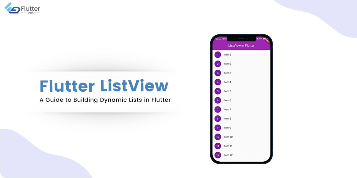
Flutter ListView – A Guide to Building Dynamic Lists in Flutter

Flutter ListView is a powerful widget that allows you to display a scrollable list of widgets in your app. It is a versatile tool for displaying lists, from simple text to complex interactive content. ListView is an essential component of any Flutter app, as it allows users to interact with and browse through content seamlessly. A ListView is simply a list of widgets that can be scrolled horizontally or vertically. This can be particularly useful for displaying long lists of items, such as contacts, products, or articles. In this blog post, we will have a complete walkthrough of the Flutter ListView widget and learn everything about it. Importance of ListView in Flutter App Development ListView is an integral part of Flutter app development. It allows developers to create complex and dynamic user interfaces easily and provides a straightforward way to handle large datasets. One of the key benefits of using ListView is that it enables you to display a large amount of data in a small amount of space. This makes it ideal for mobile devices with premium-screen real estate. In addition, ListView provides several built-in features that make it easy to customize the appearance and behavior of the widget. For example, you can change the color and style and set the font size based on the screen size for list items, add dividers between items, and specify the direction and scrolling behavior of the list. Creating a Basic ListView To create a basic ListView in Flutter, you first need to import the necessary package: Next, you can create a new ListView widget and add children widgets to it: In this example, we’ve created a ListView widget and added three ListTile children’s widgets. Each ListTile contains an icon, a title, a subtitle, and a trailing widget (in this case, an arrow icon). To customize the appearance of the ListView, you can use properties such as padding, backgroundColor, and shrinkWrap. You can also use the scrollDirection property to change the direction of the list and the physics property to change the scrolling behavior. You can also use the ListView widget inside a Column widget to add other widgets alongside it, such as headers or footers. To do this, wrap the ListView widget inside the Expanded widget to allow it to take up the available space: In this example, we’ve added a header and a footer to the Column widget and wrapped the ListView widget inside an Expanded widget. This allows ListView to occupy all the space between the header and footer widgets. Using ListView.builder Sometimes, you may not know the exact number of items displayed in your ListView. This is where the ListView.builder widget comes in handy. ListView.builder is a more efficient way to create a scrollable list of widgets with a specific number of items. Creating a ListView with ListView.builder To create a ListView with ListView.builder, you need to specify the number of items you want to display using the itemCount property. You also need to define an itemBuilder function that returns a widget for each item in the list: In this example, we’ve created a ListView with 10 items, and each item is represented by a ListTile widget with a title that displays the item’s index. Building a Horizontal ListView By default, ListView displays items vertically. However, you can use the scrollDirection property to make it display items horizontally: In this example, we’ve set the scrollDirection property to Axis.horizontal, and we’ve wrapped each ListTile in a Card widget to give it a more polished appearance. Adding Separator to ListView You can also add separators between the items in your ListView using the Divider widget: In this example, we’ve added a Divider widget after each ListTile using a Column widget. Creating a Nested ListView You can also create a nested ListView within another ListView. Here is how: In this example, we’ve created a nested ListView within the parent ListView using a Column widget. We’ve also used the shrinkWrap property to wrap the child ListView tightly around its contents and the ClampingScrollPhysics to limit the scrolling of the child ListView to the size of its contents. Wrapping ListView in SingleChildScrollView If you need to add a ListView to a screen that also contains other widgets, you can wrap the ListView in a SingleChildScrollView widget to ensure that the entire screen is scrollable: In this example, we’ve wrapped the ‘ListView’ in a ‘SingleChildScrollView’ widget to ensure that the entire screen can be scrolled if necessary. We’ve also set the shrinkWrap property of the child ListView to true to allow it to take up only the necessary amount of space and the ‘NeverScrollableScrollPhysics’ to disable scrolling of the child ListView. Usually, we use the Column widget to stack the header, ListView, and footer widgets vertically. By wrapping the ListView widget in a Column widget, we can add additional widgets to the screen while still maintaining the ability to scroll through the entire content. The Text widgets at the top and bottom of the Column represent the header and footer sections of the screen, respectively. Adding Background Color to ListView You can add a background color to your ListView by wrapping it in a Container widget and setting the color property: In this example, we’ve wrapped the ListView in a Container widget and set the color property to Colors.grey[200] to give it a light grey background. You can use any color you like by specifying a different color property value and adding a border to the container. By default, the background color of a ListView is transparent, so wrapping it in a Container widget allows you to add a background color to the entire widget. You can also use this technique to add borders, padding, or other customizations to your ListView as needed. Controlling Scroll and Navigation in Flutter ListView ListView provides several built-in features that allow you to control the scrolling and navigation behavior of the widget. This section’ll explore some common use cases for controlling scroll and navigation in ListView. Navigating

Read More »

Flutter Stepper Widget: Build Multi-Step Forms Easily

As a Flutter developer, you’re likely familiar with the wide variety of widgets available to create seamless and interactive user interfaces. Among these widgets, the stepper plays a crucial role in breaking down complex forms or processes into smaller, more manageable steps.  In this blog post, we will dive into the stepper widget in Flutter, discussing its uses, customization options, and even the creation of a custom stepper. By the end of this guide, you’ll have a solid understanding of how to implement and customize the Stepper widget in your Flutter projects. What is a Stepper in Flutter? A stepper is a UI component that visually guides users through a sequence of steps in a linear or non-linear process. In Flutter, the stepper widget provides a simple and intuitive way to manage multi-step processes, such as forms, onboarding flows, or setup wizards. With its built-in navigation and validation features, the stepper widget makes creating organized and user-friendly experiences easy. Setting Up the Development Environment Before diving into the stepper widget, ensure Flutter and Dart is installed on your machine. Follow the official Flutter installation guide for your operating system to set up your development environment. Once Flutter and Dart are installed, create a new Flutter project by running the following command in your terminal or command prompt: flutter create my_stepper_app Replace “my_stepper_app” with your desired project name. After creating the project, please navigate to the folder and open it in your favorite code editor. How to use the Stepper widget in Flutter? To begin implementing the stepper widget, open the ‘lib/main.dart‘ file in your project and replace the existing code with the following: Output: In this example, we created a simple stepper with three steps. The _currentStep variable keeps track of the active step. The onStepTapped, onStepContinue, and onStepCancel callbacks handle user interactions, allowing users to navigate the steps. You may also want to read: A Guide to Flutter Chip Widget. Customizing and Decorating the Stepper Widget The Stepper widget provides several properties to customize its appearance. You can modify the color, shape, and style of the step icons, labels, and content using the Step class properties, such as active color, title, subtitle, state, and content. Additionally, you can decorate this widget by wrapping it in a Container widget and applying a BoxDecoration. Here’s an example of how to customize the stepper: Stepper( currentStep: _currentStep, onStepTapped: (step) => setState(() => _currentStep = step), onStepContinue: _currentStep < 2 ? () => setState(() => _currentStep += 1) : null, onStepCancel: _currentStep > 0 ? () => setState(() => _currentStep -= 1) : null, controlsBuilder: (BuildContext context, {VoidCallback onStepContinue, VoidCallback onStepCancel}) { return Padding( padding: const EdgeInsets.symmetric(horizontal: 8.0), child: Row( children: <Widget>[ ElevatedButton( onPressed: onStepContinue, child: const Text(‘Continue’), ), SizedBox(width: 8.0), TextButton( onPressed: onStepCancel, child: const Text(‘Cancel’), ), ], ), ); }, steps: [ Step( title: Text(‘Step 1’), content: Text(‘This is the first step.’), state: _currentStep == 0 ? StepState.editing : StepState.complete, isActive: _currentStep == 0, ), Step( title: Text(‘Step 2’), content: Text(‘This is the second step.’), state: _currentStep == 1 ? StepState.editing : StepState.complete, isActive: _currentStep == 1, ), Step( title: Text(‘Step 3’), content: Text(‘This is the final step.’), state: _currentStep == 2 ? StepState.editing : StepState.complete, isActive: _currentStep == 2, ), ], ) In this example, we’ve used the controlsBuilder property to create custom ‘Continue’ and ‘Cancel’ buttons. We’ve also set the state and isActive properties of each step to update their appearance based on the current step. Vertical Stepper in Flutter By default, the stepper widget displays steps horizontally. However, you can create a vertical stepper by setting the type property of the Stepper widget to StepperType.vertical.  Let’s see how it is done with the help of an example. Here is the code: Output: In this example, we’ve only added the type: StepperType.vertical property to the previous horizontal stepper example. The rest of the implementation remains the same. Stepper Widget Methods and Functions When working with the Stepper widget, you may need various widget methods and functions for interactivity and customization. Some common methods include: setState(): Updates the state of a StatefulWidget, triggering a rebuild of the widget tree. Navigator.pop(): Closes the current screen and returns to the previous screen in the navigation stack. Navigator.push(): Opens a new screen on top of the current screen in the navigation stack. 👉 Flutter inherited widget Manipulating Widget Positions in Flutter To change a widget’s position in Flutter, you can use layout widgets such as Align, Positioned, and Container. Combining these widgets with the stepper allows you to create a custom layout to position the stepper and its elements within the screen. For instance, you can wrap the Stepper widget in a Center or Align widget to position it in the center or other parts of the screen. Here is an example: Center( child: Stepper( // Stepper implementation ), ) For fixed-position widgets, you can use the Positioned widget within a Stack Widget. This allows you to place the widget at specific x and y coordinates within the stack. Let us see the change in position with the help of an example.   Stack( children: [ // Other widgets Positioned( top: 50, left: 50, child: Stepper( // Stepper implementation ), ), ], ) Creating a Custom Stepper in Flutter Sometimes, you may want to create a custom stepper beyond the built-in styling and behavior options. To create a custom stepper widget, follow these steps: Create a new StatefulWidget that extends the base StatefulWidget class. Define a custom State class with the necessary state variables for your stepper. Implement the desired stepper appearance, behavior, and functionality using a combination of basic widgets and custom logic. Here’s a simple example of a custom stepper:   class CustomStepper extends StatefulWidget { @override _CustomStepperState createState() => _CustomStepperState(); } class _CustomStepperState extends State<CustomStepper> { int _currentStep = 0; List<Widget> _stepIndicators() { List<Widget> indicators = []; for (int i = 0; i < 3; i++) { indicators.add( Container( decoration: BoxDecoration( shape: BoxShape.circle, color: _currentStep == i ? Colors.blue

Read More »

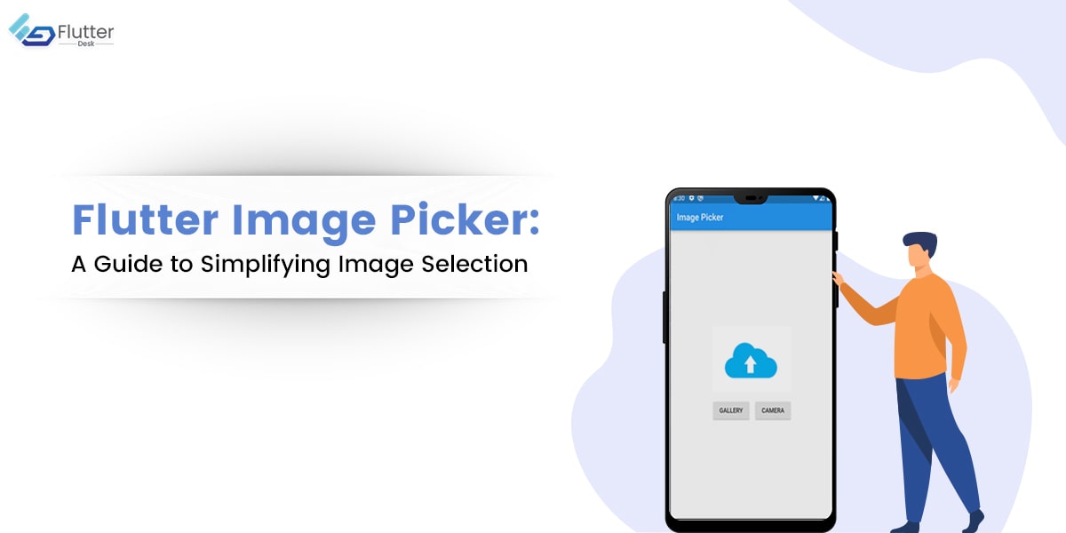
Flutter Image Picker: A Guide to Simplifying Image Selection

In the previous blog, we learned about Flutter Choice Chip in detail, and today we will learn about Flutter Image Picker. Image Picker in Flutter is a powerful plugin that enables Flutter developers to integrate image selection and capture functionality into their mobile applications. With file picker flutter, developers can quickly and easily create an intuitive user interface that allows users to select images, videos, or any other file from their device’s camera roll or capture new images. This plugin offers a range of customization options and can be implemented with minimal coding effort, making it an ideal solution for developers looking to streamline the development process. Throughout this post, we will cover the essential aspects of using Image Picker, including installation and configuration, creating an effective UI, handling selected images, best practices for optimizing performance, and troubleshooting common issues. Whether you are a beginner or an experienced Flutter developer, this guide provides a comprehensive resource for learning how to implement image-picking functionality in your Flutter app.  What is Flutter Image Picker? Flutter Image Picker is a popular and useful plugin that enables Flutter developers to easily incorporate image selection and capture capabilities into their mobile applications. With this plugin, you can create a user-friendly interface that allows users to choose photos and videos from their device’s gallery or take new photos with their cameras. This plugin is designed to be simple, with a straightforward API that can be easily integrated into your existing Flutter codebase. In addition, it offers a range of customization options, enabling you to tailor the UI to suit your app’s specific needs. Let’s dive in and explore this amazing Flutter package’s many features and capabilities. Features and Functionalities of Image Picker Flutter Flutter Image Picker offers a variety of features and functionalities that make it an excellent choice for mobile app development. Some of its key features include: How Does Image Picker in Flutter Work? To use Image Picker in your app, you must add the plugin to your project’s dependencies, configure the plugin with your desired options, and then create the UI for the image picker. Once the user has selected an image, you can use the plugin’s built-in functions to handle it and perform any necessary actions, such as uploading the image to a server or displaying it on the screen. Let’s walk you through the steps to use this plugin in your app. So, keep reading to learn more! How do we use Flutter Image Picker? Using Image Picker is a straightforward process that involves three main steps: adding the plugin to your project, configuring the plugin, and creating the UI for the image picker plugin. Step 1: Add the plugin to your project To use Flutter Image Picker, add it as a dependency in your project’s pubspec.yaml file. You can do this by adding the following line to the file: dependencies: image_picker: ^0.8.4+2 Once you’ve added the dependency, run Flutter packages get to install the plugin. Step 2: Configure the plugin Next, you need to configure the plugin by setting any desired options. For example, you can set the maximum number of images the user can select, the image quality, and the source of the images (e.g., camera or gallery). Here’s an example of how to configure the plugin: In this example, we’re setting the source to the gallery and setting the maximum width and height of the image to 1920 and 1200 pixels, respectively. We’re also setting the image quality to 80%. Step 3: Create the UI for the image picker Finally, you need to create the UI for the image picker. When pressed, you can add a button or other user interface element to your app that triggers the image picker. Here’s an example: In this example, we’re using an ElevatedButton widget to create a button that opens the image picker when pressed. When the user selects an image, we set the _imageFile variable to the selected file and then update the UI to display the selected image. And that’s it! With these three simple steps, you can easily integrate Flutter Image Picker into your app and provide users with a seamless and intuitive photo selection experience. Advanced Features of Flutter Image Picker While this plugin provides a simple and user-friendly way to select and capture images, it also offers a range of advanced features that can help you customize the user experience and streamline your app’s workflow. Multi-image Selection Flutter Image Picker allows you to select multiple images at once, making it easy for users to select and upload multiple photos to your app quickly. To enable multi-image selection, set the maxImages property to the desired number of images: In this example, we allow the user to select up to five images simultaneously. Video Selection In addition to photos, Flutter Image Picker allows you to select videos from the user’s camera roll or directly from the camera. To select a video, use the getVideo method: In this example, we’re selecting a video from the gallery. You can also set the source property to ImageSource.camera to capture video directly from the camera. Custom Image Providers If you need more control over how images are loaded and displayed in your app, Flutter Image Picker allows you to use custom image providers. This means you can use your own logic to load images from local or remote sources and display them in your app’s UI. Here’s an example: In this example, we use a custom image provider called MyCustomImageProvider to load and display the selected image. By leveraging these advanced features, you can create a more customized and powerful image selection experience for your users and streamline your app’s workflow. Handling Image Compression and Optimization Flutter Image Picker provides options for compressing and optimizing images to reduce their size without sacrificing quality. You can use the ‘compress’ and ‘maxWidth’ properties to specify the resulting image file’s compression quality and maximum width. You can also use the ‘imageQuality’ property to control

Read More »