Skip to content
You might have seen a menu in the apps that allow you to select the date by scrolling through the day, month, and year. That’s the date picker, in technical terms. Being a Flutter developer, you might be concerned about learning how to create a date picker in Flutter. In this blog, we will cover everything you need to know about the Cupertino date picker in Flutter.
Before moving forward, let’s get to know what Cupertino Flutter is.
What is Cupertino in Flutter?
Cupertino in Flutter refers to the collection of widgets and styles similar to the look and feel of Apple’s iOS design. It includes widgets such as CupertinoButton, CupertinoAlertDialog, and CupertinoNavigationBar, which we use to create an app that closely resembles an iOS app. The Cupertino library is part of the Flutter framework that helps create cross-platform apps that look and feel like native iOS apps.
So what’s this Cupertino date picker? Let’s get to know. 😉
Cupertino Date Picker in Flutter
The Cupertino date picker in Flutter is a user interface (UI) element that allows users to select a date from a calendar-like layout. This picker is designed to be similar to the date picker found in iOS, making it a great option for developers looking to create apps with a similar aesthetic.
You will first need to set up a new project to start with the Cupertino date picker in Flutter. Once your project is set up, you can incorporate the Cupertino date picker flutter into your app layout.
Let’s see an example of date pickers so that you can better understand how they work.
Flutter Date Picker Example
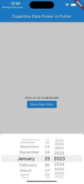
Here we will create a Cupertino date picker using CupertinoDatePickerMode.date property. It will give you the option to choose a date.
Here is the code.
class HomePage extends StatefulWidget {
  const HomePage({Key? key}) : super(key: key);
  @override
  State<HomePage> createState() => _HomePageState();
}
class _HomePageState extends State<HomePage> {
  DateTime? date;
  @override
  Widget build(BuildContext context) {
    return Scaffold(
      appBar: AppBar(
        title: const Text('Cupertino Date Picker in Flutter'),
      ),
      body: Center(
        child: Column(
          mainAxisAlignment: MainAxisAlignment.center,
          crossAxisAlignment: CrossAxisAlignment.center,
          children: [
            if (date == null) ...[
              const Text(
                'Select Date',
                style: TextStyle(
                  fontSize: 16,
                  fontWeight: FontWeight.w500,
                ),
              ),
            ] else ...[
              Text(date!.toString()),
            ],
            ElevatedButton(
              onPressed: () async {
                await showCupertinoModalPopup<void>(
                  context: context,
                  builder: (_) {
                    final size = MediaQuery.of(context).size;
                    return Container(
                      decoration: const BoxDecoration(
                        color: Colors.white,
                        borderRadius: BorderRadius.only(
                          topLeft: Radius.circular(12),
                          topRight: Radius.circular(12),
                        ),
                      ),
                      height: size.height * 0.27,
                      child: CupertinoDatePicker(
                        mode: CupertinoDatePickerMode.date,
                        onDateTimeChanged: (value) {
                          date = value;
                          setState(() {});
                        },
                      ),
                    );
                  },
                );
              },
              child: const Text('Show Date Picker'),
            ),
          ],
        ),
      ),
    );
  }
}
Output
How to Customize date picker in Flutter?
Customizing the appearance of the Cupertino date picker is relatively simple. You can change the flutter date picker color, adjust the font size and alignment of the text, and change the picker’s background color. Additionally, you can add and customize the “Done” and “Cancel” buttons at the picker’s bottom.
Isn’t it interesting? 😍 You must agree.
When implementing the Cupertino date picker in your app layout, it is important to consider your app’s overall design and flow. You should place the date picker in an appropriate location that is easily accessible to the user. Additionally, it should be designed so that it doesn’t take up too much space and doesn’t interfere with the other elements on the screen.
How to Change Flutter Date Picker Color?
By default, flutter shows a transparent color of the date picker modal popup menu. You may need to change that as well since your app screen might have a color that makes the modal popup less visible or for any other reason. So how do you change the flutter date picker color?
For that, you need to assign any other color from the backgroundColor property as you can see in the code below.
backgroundColor: Colors.blueGrey,Output

You should value that creating a seamless user experience with the Flutter custom date picker is about providing users with a clear and intuitive interface that is easy to navigate. This can be accomplished by highlighting the selected date, providing clear and concise instructions, and allowing users to navigate the different months and years easily.
Advanced Features of the Cupertino Date Picker
We can use the Flutter date range picker in conjunction with other widgets in your app to create a dynamic and responsive user interface. For example, you can use the date picker with a time picker to allow users to select both the date and time. You can also use the date picker in conjunction with other UI elements to create more advanced functionality, such as the ability to create recurring events.
Tips and tricks for optimizing the performance of the Cupertino date picker include using the picker in conjunction with other widgets and elements in your app and being mindful of the overall design and layout. It’s also important to test the performance of the picker on different devices and in different scenarios to ensure that it is functioning as intended.
Conclusion
One of the key benefits of using the Cupertino date range picker in your app is that it provides a consistent and familiar interface for users. This can help to improve the overall user experience, as users are more likely to know how to interact with the date picker if it is similar to what they are used to. Additionally, the Cupertino date picker is highly customizable, allowing developers to easily adjust its appearance to match their app’s overall design.
This was it for the guide to Cupertino Flutter, and we tried to cover it up as much as possible. If you still have any questions or suggestions, you can ask away. Or you can hire Flutter developers to help you solve the complex technical issues you might be facing with your app and turn it into a substantial product.
Thank you for standing by! See you in the next blog. 😉